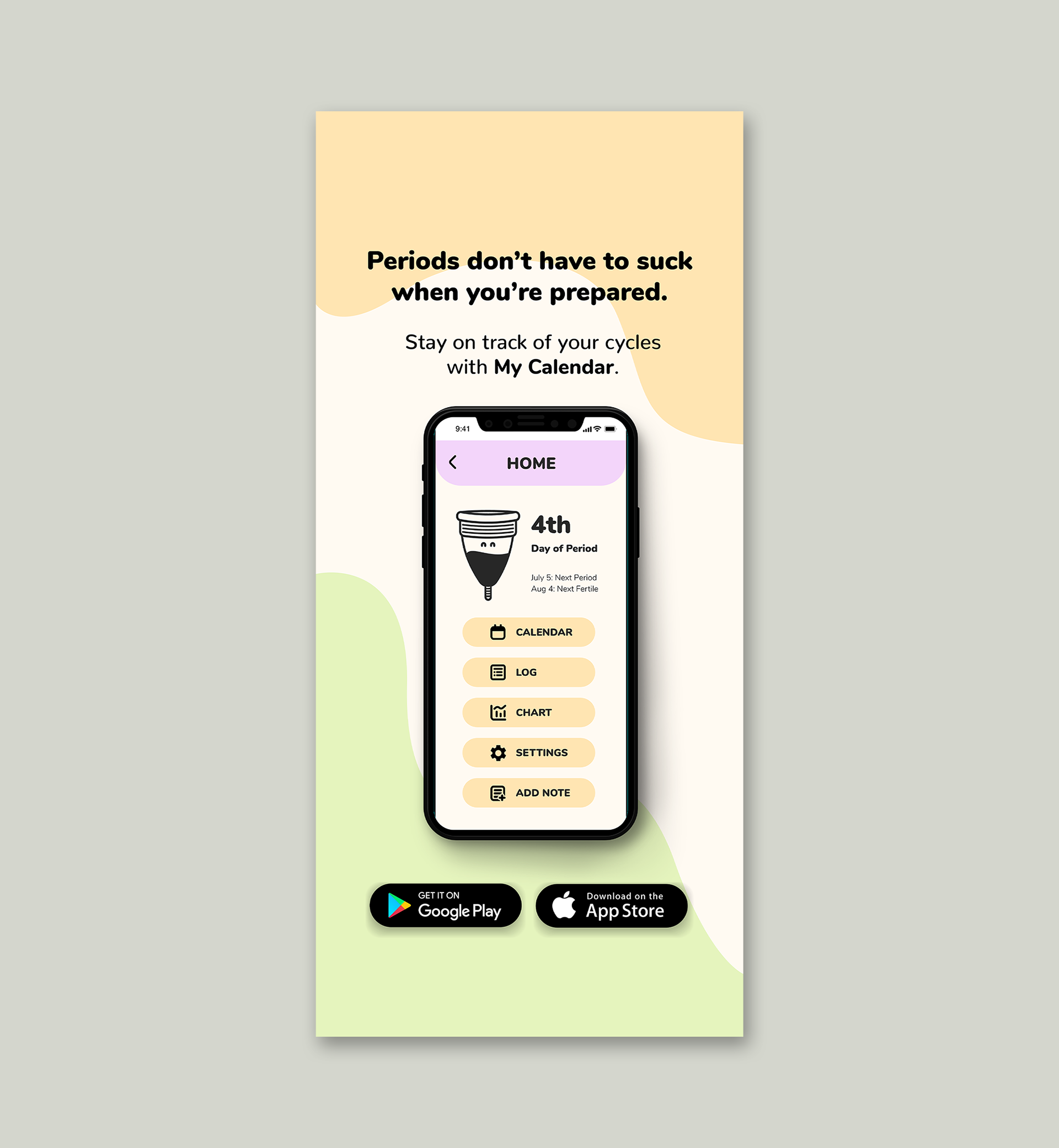
My Calendar is a period tracking mobile application that helps users keep track of their periods, cycle, ovulation, and fertile days. I created their new tagline: “Periods don’t have to suck when you’re prepared.”
The goal of the re-design was to make the app user-friendly, simple, and appealing to all people who have periods.
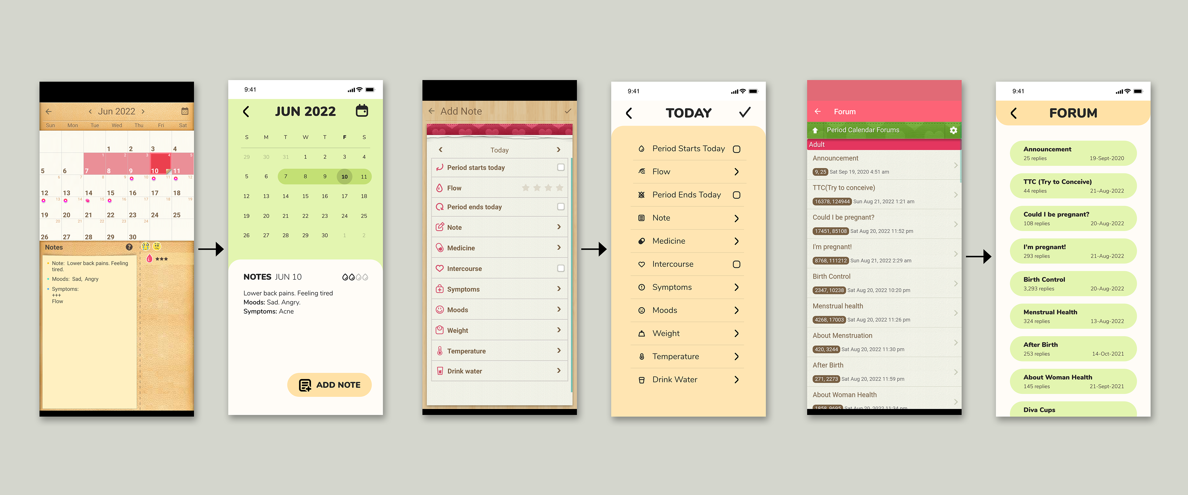
Designing an app that would look consistent across small screen sizes while including the most important information was a constraint of the project.
I drafted some ideas for each of the pages before bringing it into Adobe Illustrator and Adobe XD. Having a side-by-side view of the previous version helped ensure that the information was accurate, although the new design would have a completely different look and feel.
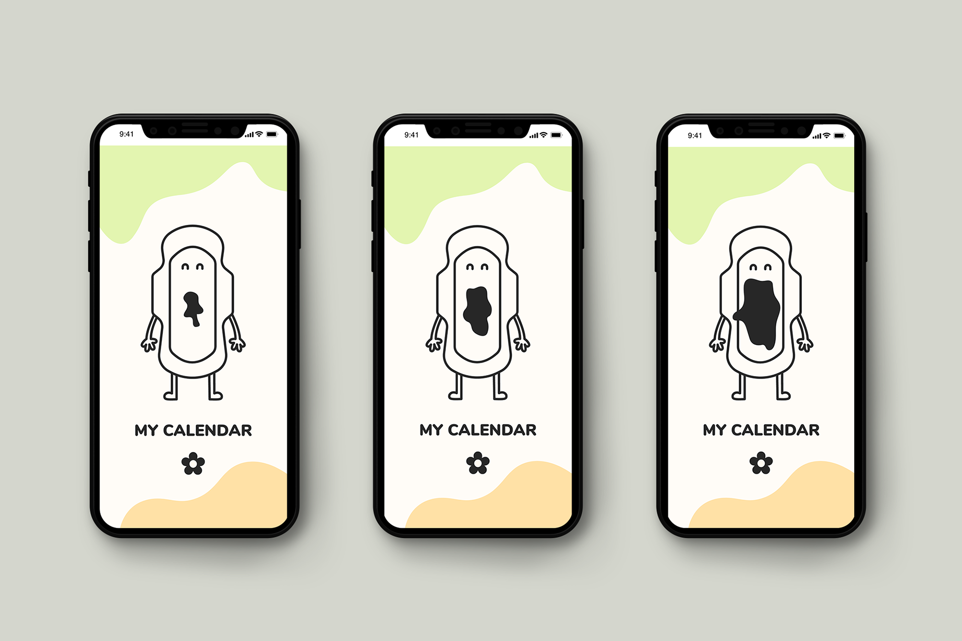
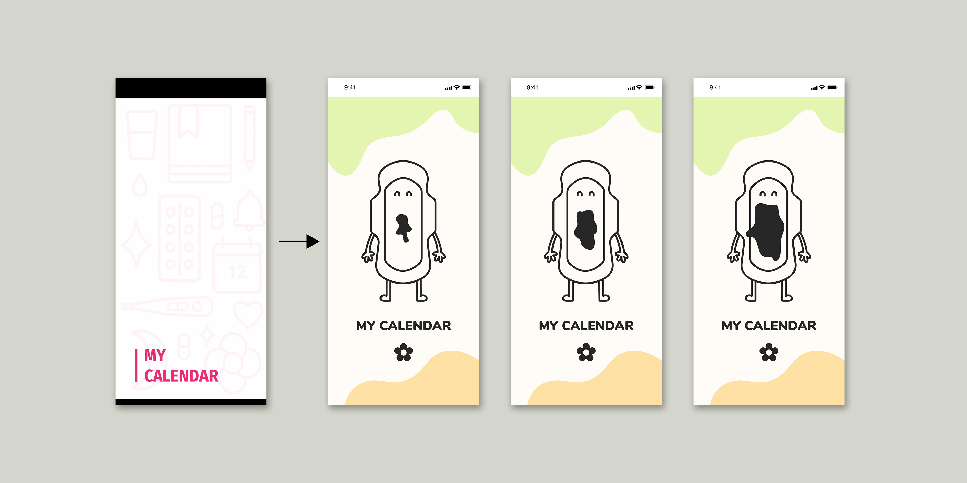
I wanted the app to feel welcoming while breaking down the stigma of periods as a negative experience. To do this, I illustrated popular period products including a tampon, diva cup, and pad, while making them feel personable.

I chose the Nunito typeface because it is clean, easy-to-read on small screens, and features rounded corners for a gentle feel.
By selecting a softer, calming palette, I wanted user to feel cared for and in control when using this app. I also wanted to differentiate this app from all other period apps by moving away from the classic pink colour scheme and hyper-feminine design.
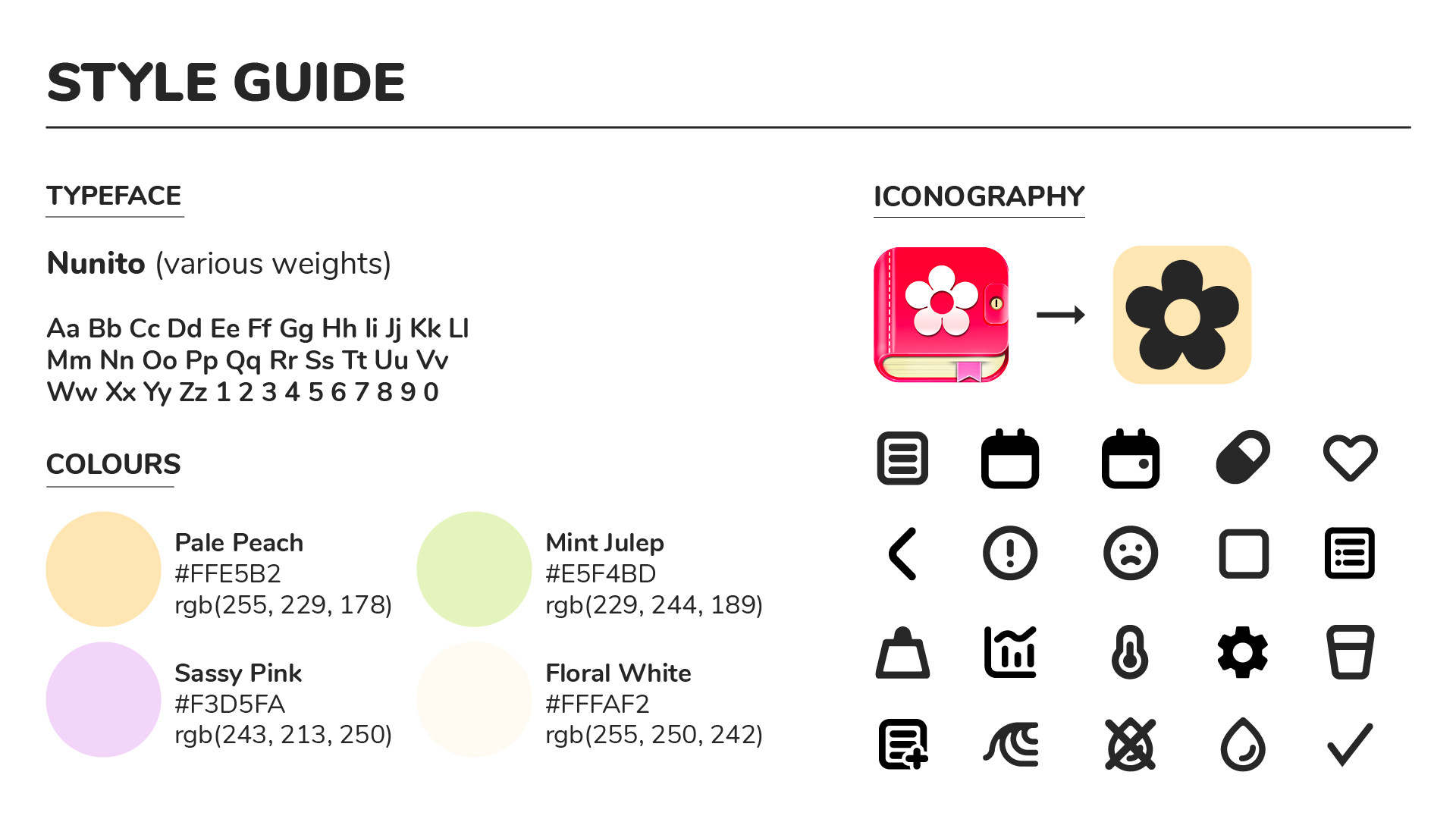
I’ve simplified the logo down to it’s main component: the five-petal rounded flower. I’ve also flattened the icon to give it a modern look.
The goal with updating the icons was to make them consistent in weight/detail and easily understandable. I made use of rounded edges throughout the app—this includes the buttons, text, and iconography.
Using Adobe Illustrator, I drew a pad to be used for the splash screen. I gave this page a bit of movement by increasing the bleed on the pad as a cue to the user as the app loads.
I turned the welcome screen into it's own page rather than a pop-up and reduced the amount of words on this screen for two options: "New User" and "Login". The button for "New User" is made to stand out, to make it even easier for a new user to create an account.
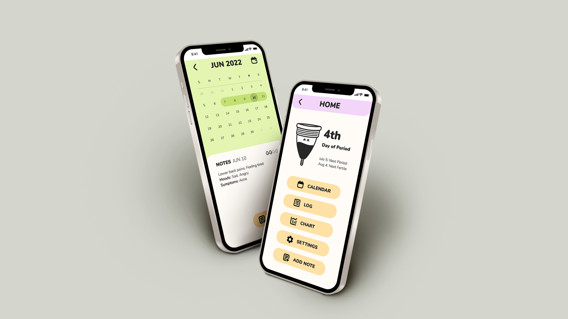
The home screen has also been updated with orange buttons with equal weight.
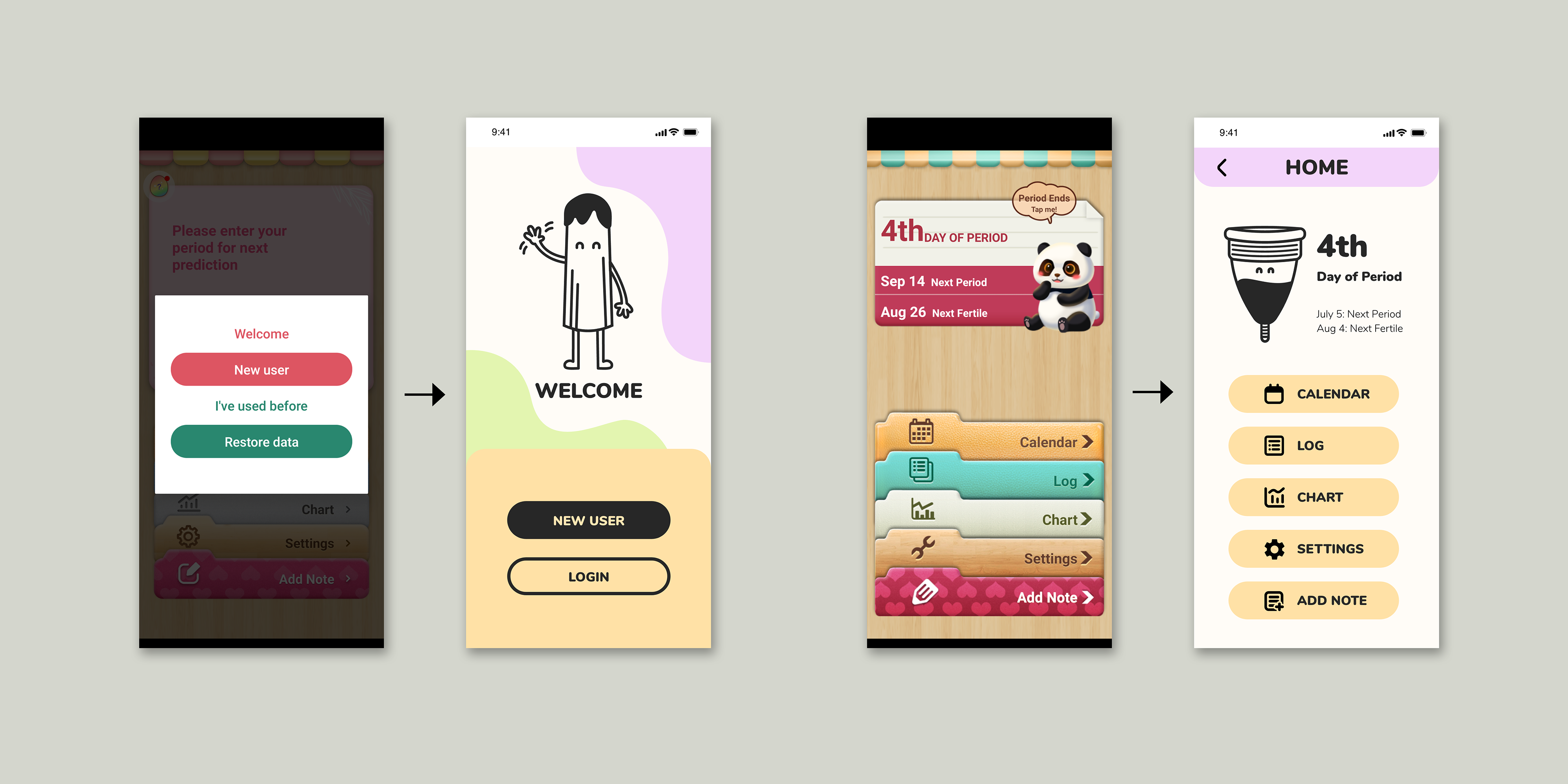
The updated version of this app portray the same information while unnecessary, repeated words/icons were removed for an improved UX design.
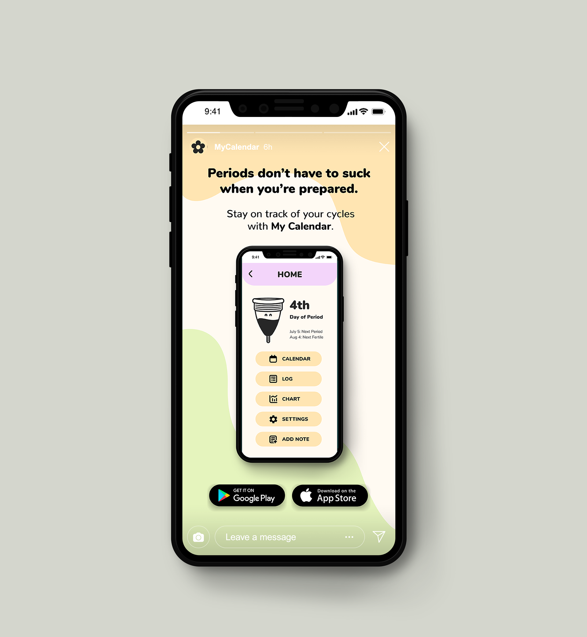
I created an Instagram story advertisement that was to-the-point and simple, just like the app itself.