main squeeze (noun) : slang, meaning one's best pal/lover
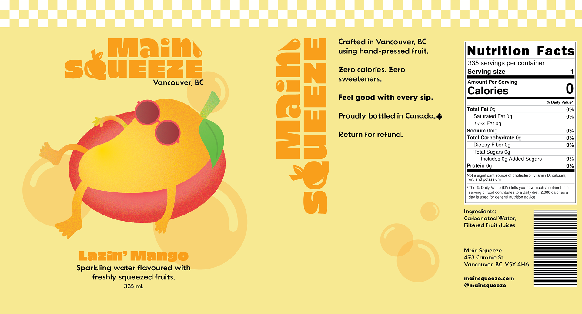
Main Squeeze is a soda water company based in Vancouver, BC.
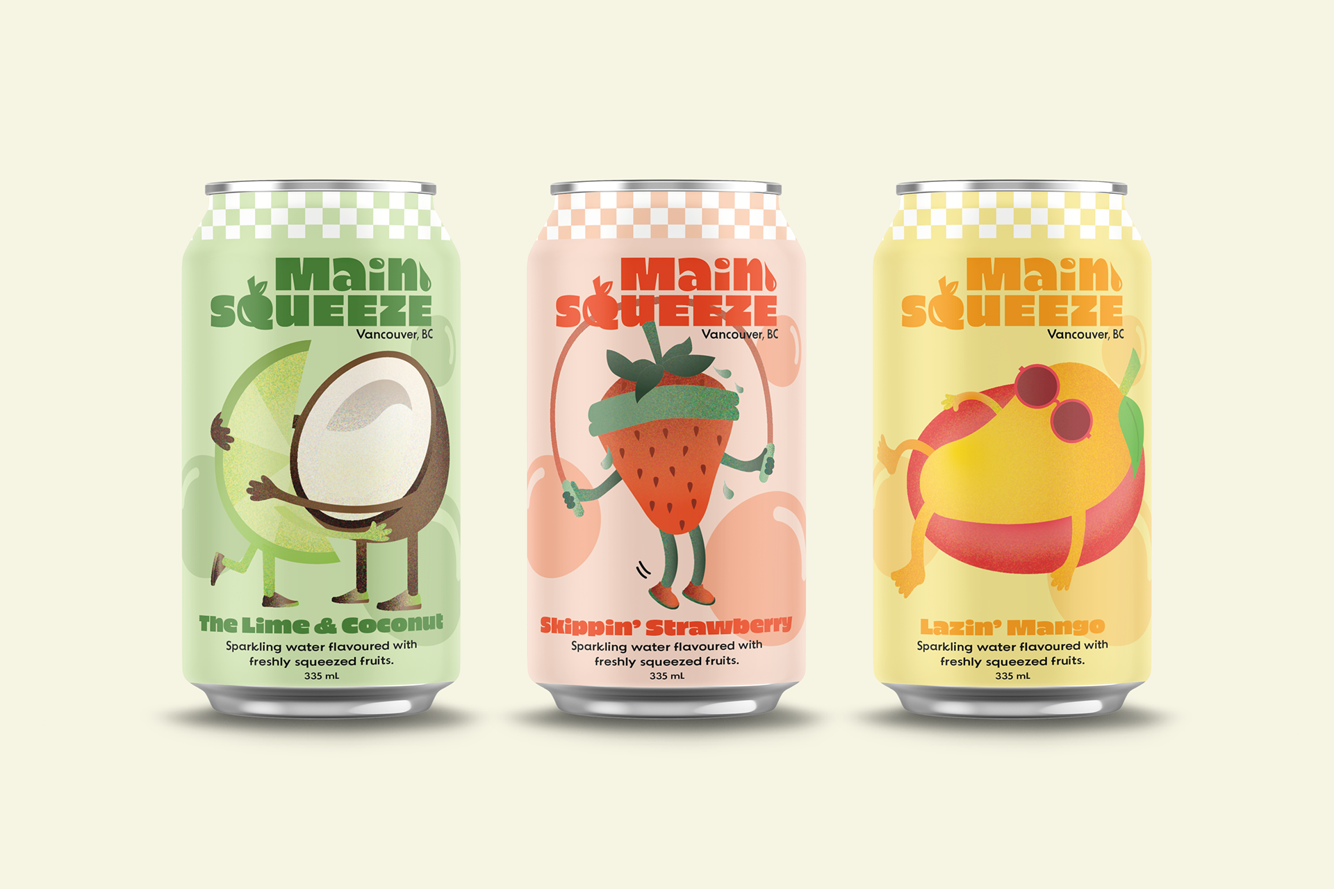
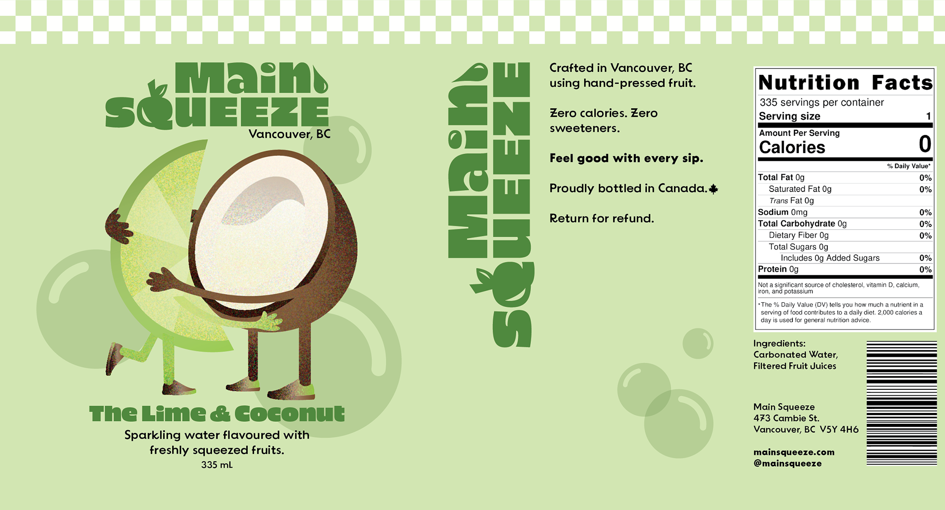
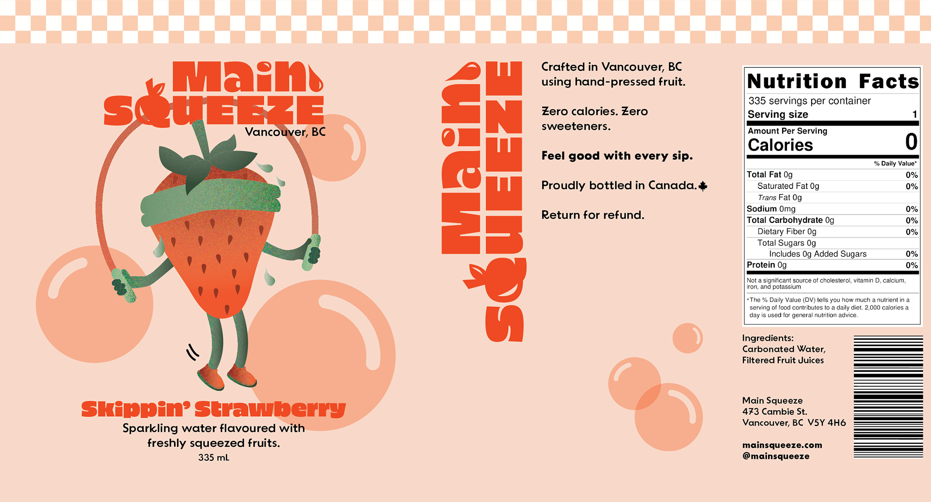
Unlike other soda water companies that use “natural flavours”, this soda is flavoured using hand-pressed—freshly squeezed—fruit juices. It is sourced with local ingredients whenever possible and both crafted and canned locally in Vancouver. It's a non-alcoholic beverage that is fun, refreshing, healthy, and suitable for all ages.
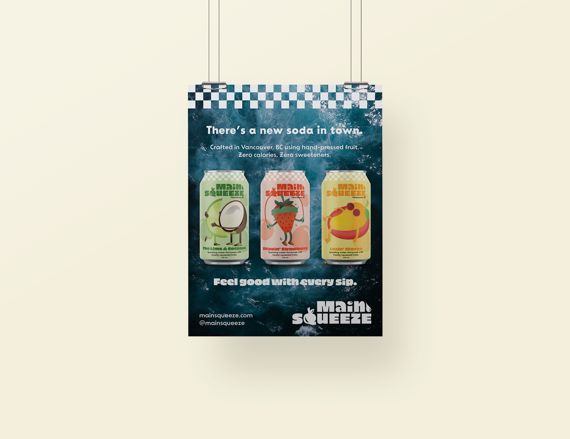
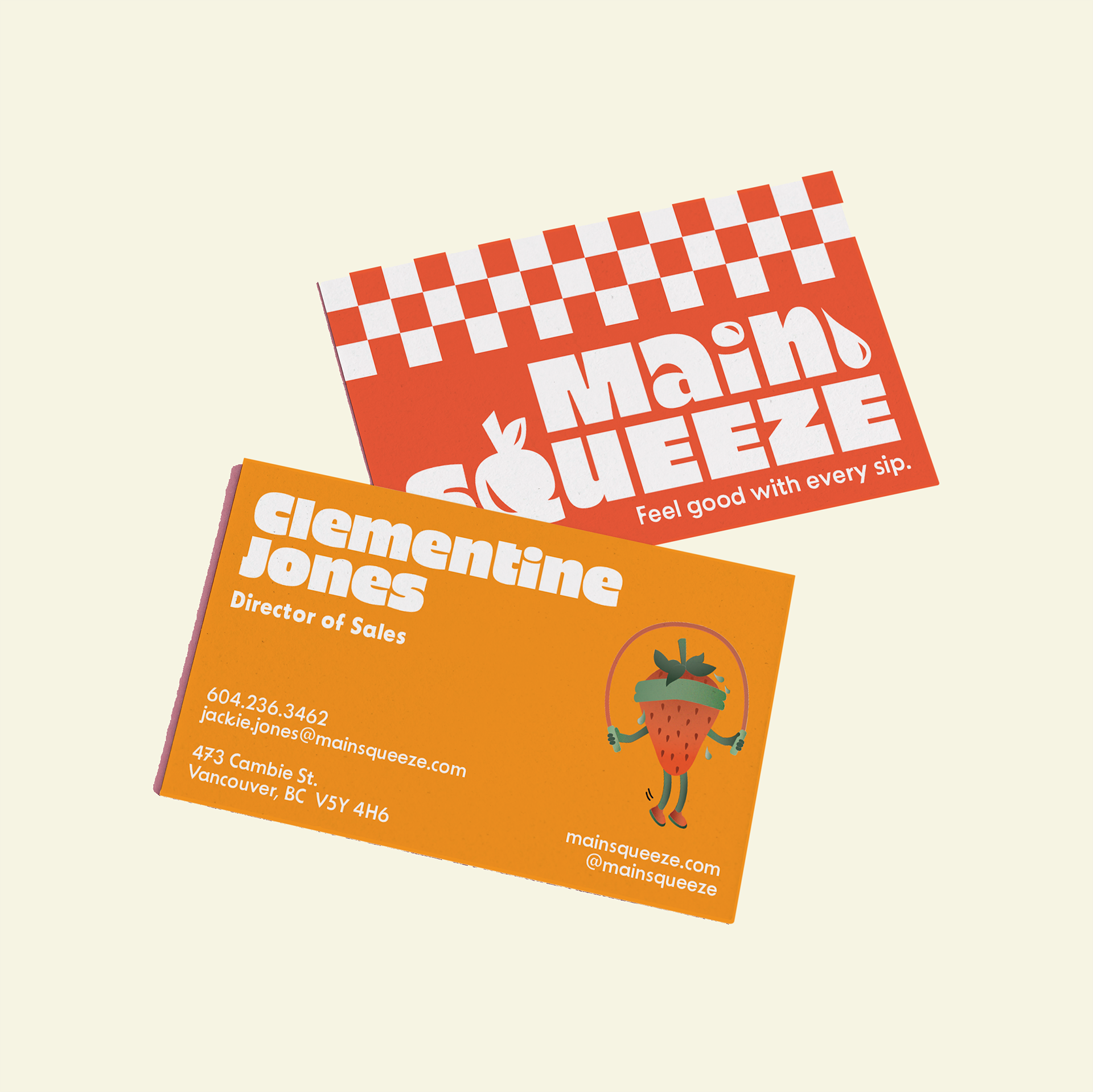
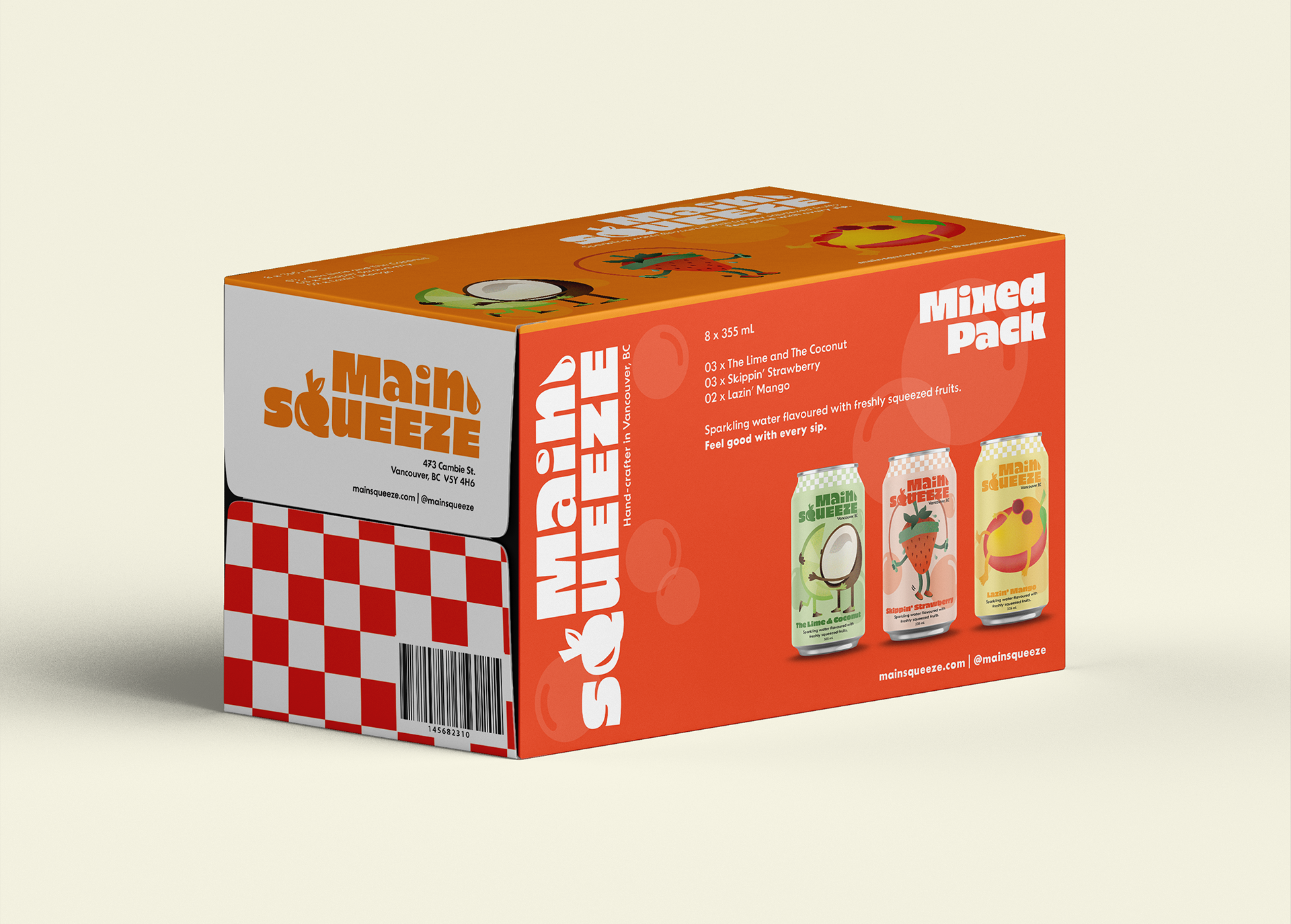
The goal of the project was to develop a brand look, identity, and packaging for the company. This included a logo design, package design for the cans and mixed pack, a print and digital ad, business cards, and merchandise.
A constraint was to create a design that would look cohesive for a variety of packaging designs, while differentiating each product from each other.
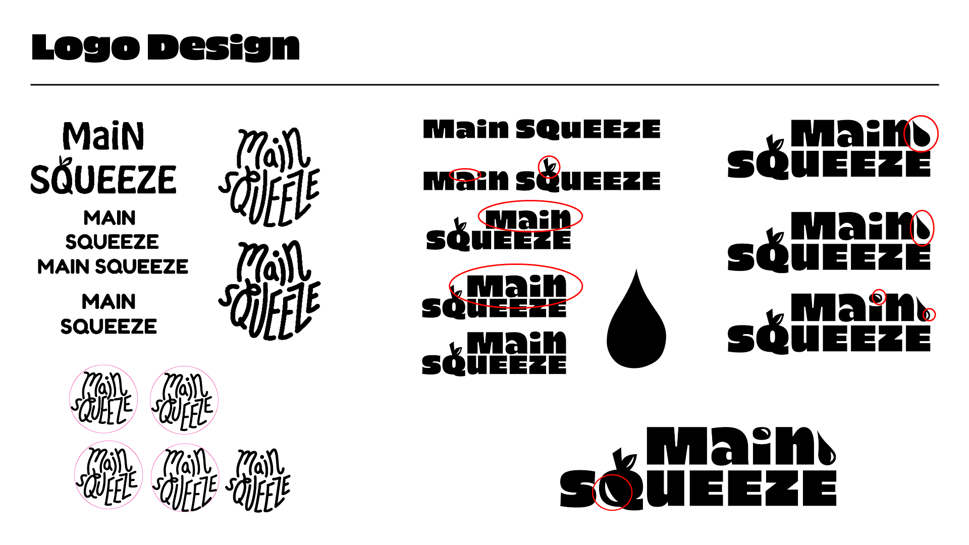
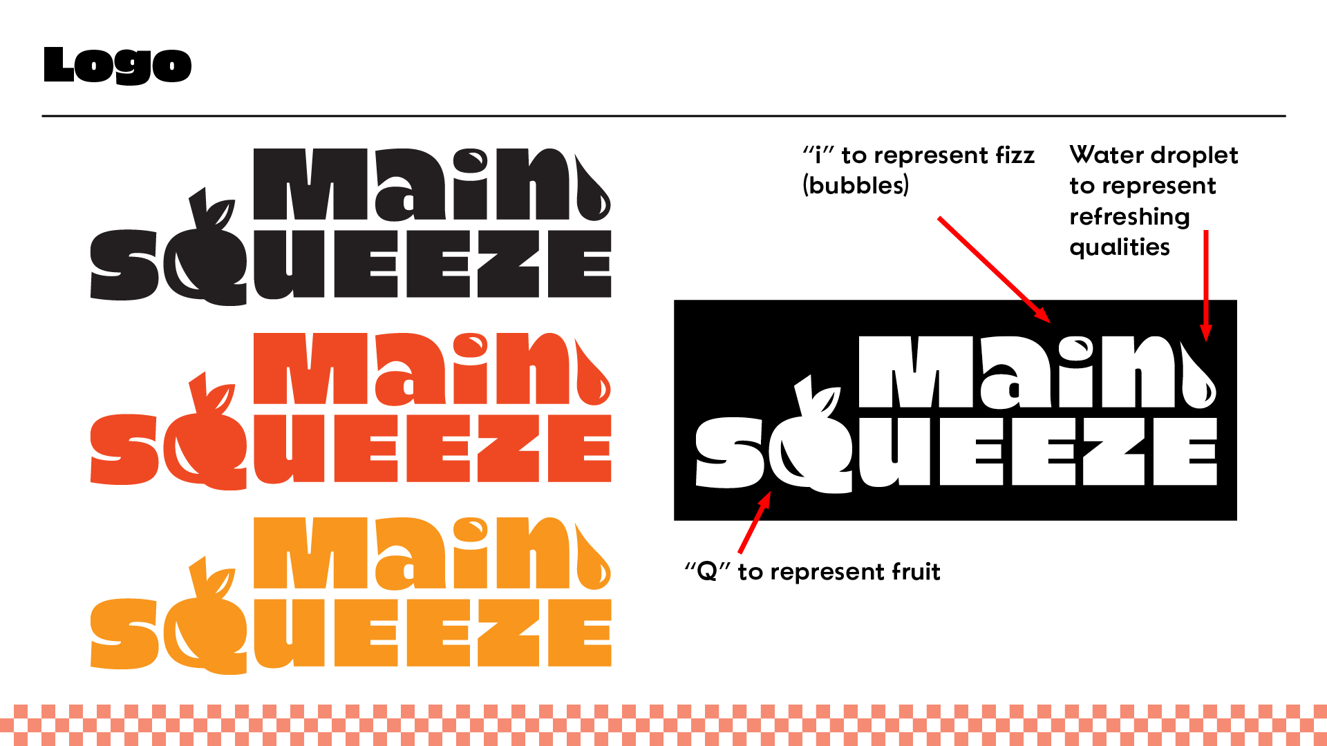
To create the logo, I played around with the idea of round shapes of bubbles, leaves of fruits, and juice droplets.
The main colours I used included Karaka Orange and Miami Marmalade which are both stimulating, juicy, and youthful.
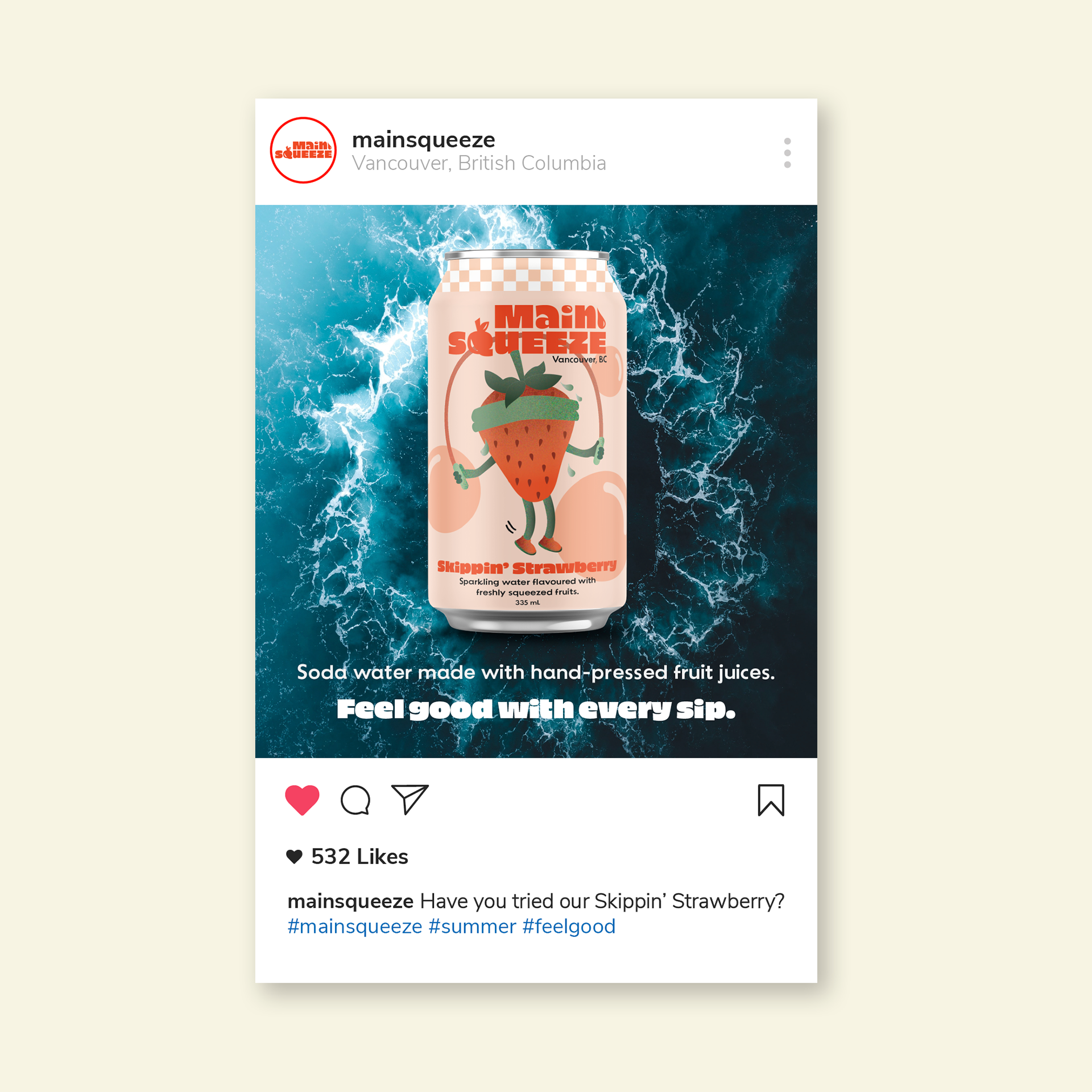
In Illustrator, I created fruity characters for each flavour with subtle colour gradients, a checkered pattern for a summery/picnic look, and bubbles to represent the drink's fizzy properties.
This product was designed to catch the attention of shoppers at grocery stores, where Main Squeeze would be available for purchase. Each side of every product stands out in its own way.
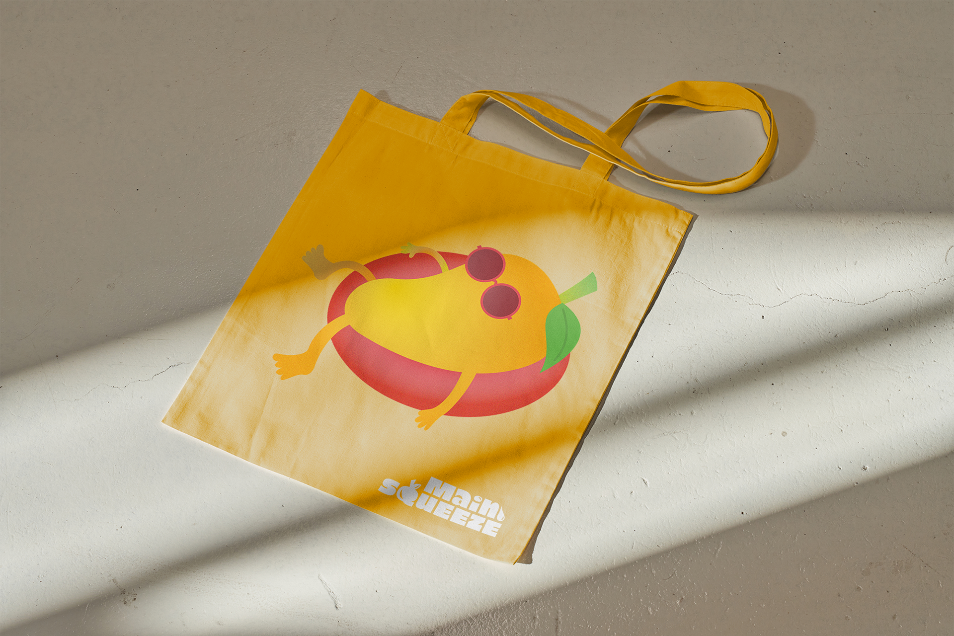
Tote bags build brand loyalty by allowing customers to pick a tote bag that matches their personality or favourite flavour. The mango version is pictured below.
I selected blue, ocean backgrounds for the ads to symbolize the refreshing qualities of the soda water. Each ad features the tagline: "Feel good with every sip."
Photos are sourced from royalty-free websites.