Little Wonders is the result of a complete rebrand for a magic shop located in the Kids Market of Granville Island in Vancouver, BC. The project included an upgraded visual identity designed to appeal to the shop's main audience—families.
I fine-tuned the language of the Little Wonders brand including their mission, vision and slogan. For example, their updated slogan, "spread a little bit of magic", is repeated across many of the materials created.
A constraint for the project was coming up with a visual language that was easily understandable and attractive for both kids and their parents.
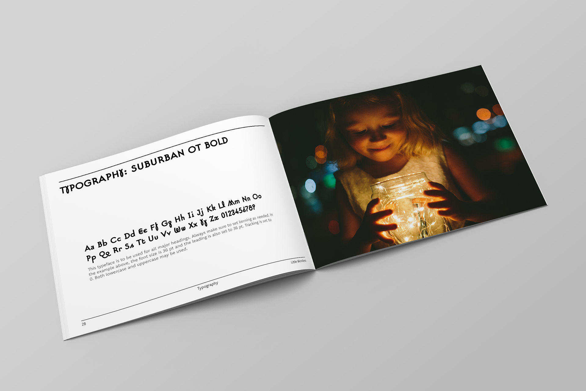
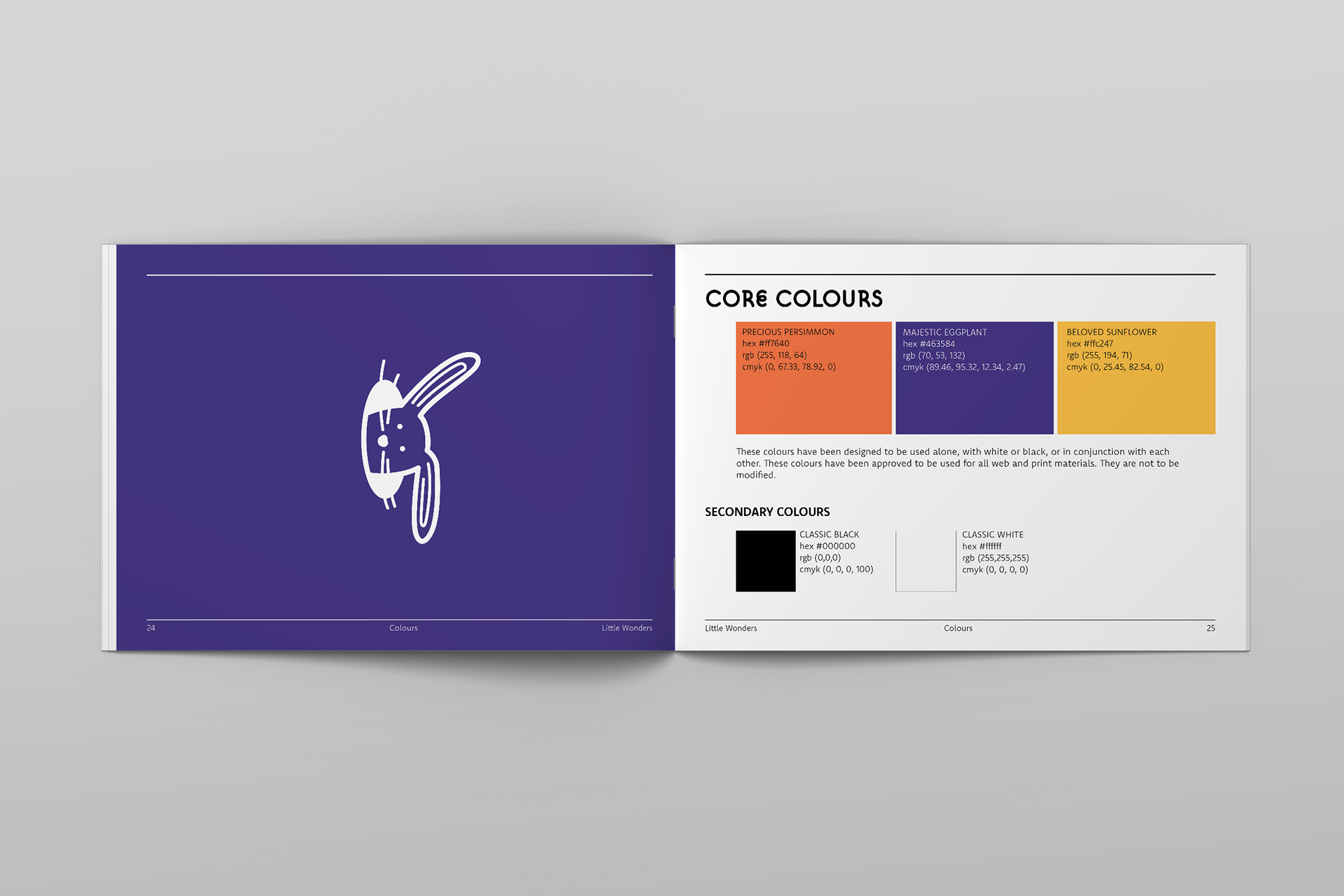
The brand refresh included a 44-page Brand Guidelines booklet which details the company's newly-defined language, logo, colours, typography, design assets, etc. I designed this booklet in inDesign using a hierarchical grid to establish a cohesive finish from page-to-page.
The full version of the Brand Guidelines can be found here.
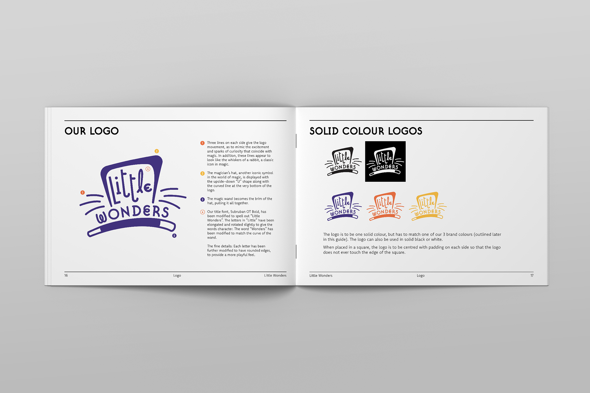
The logo was created after many variations of hand-drawn sketches and the two best concepts were digitized and modified. A brief glimpse into this process is shown below.
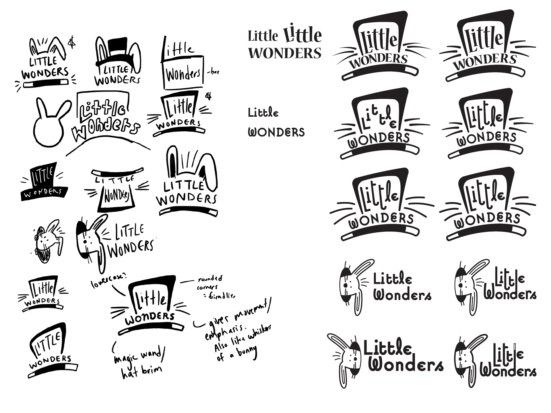
The final logo offers bold typography and visual subtleties that reflect the shop such as the magician's hat, animated bunny whiskers/sparks, and magic wand. Using the pen tool in Illustrator, I customized the words "Little Wonders" to give it a whimsical, youthful spirit.
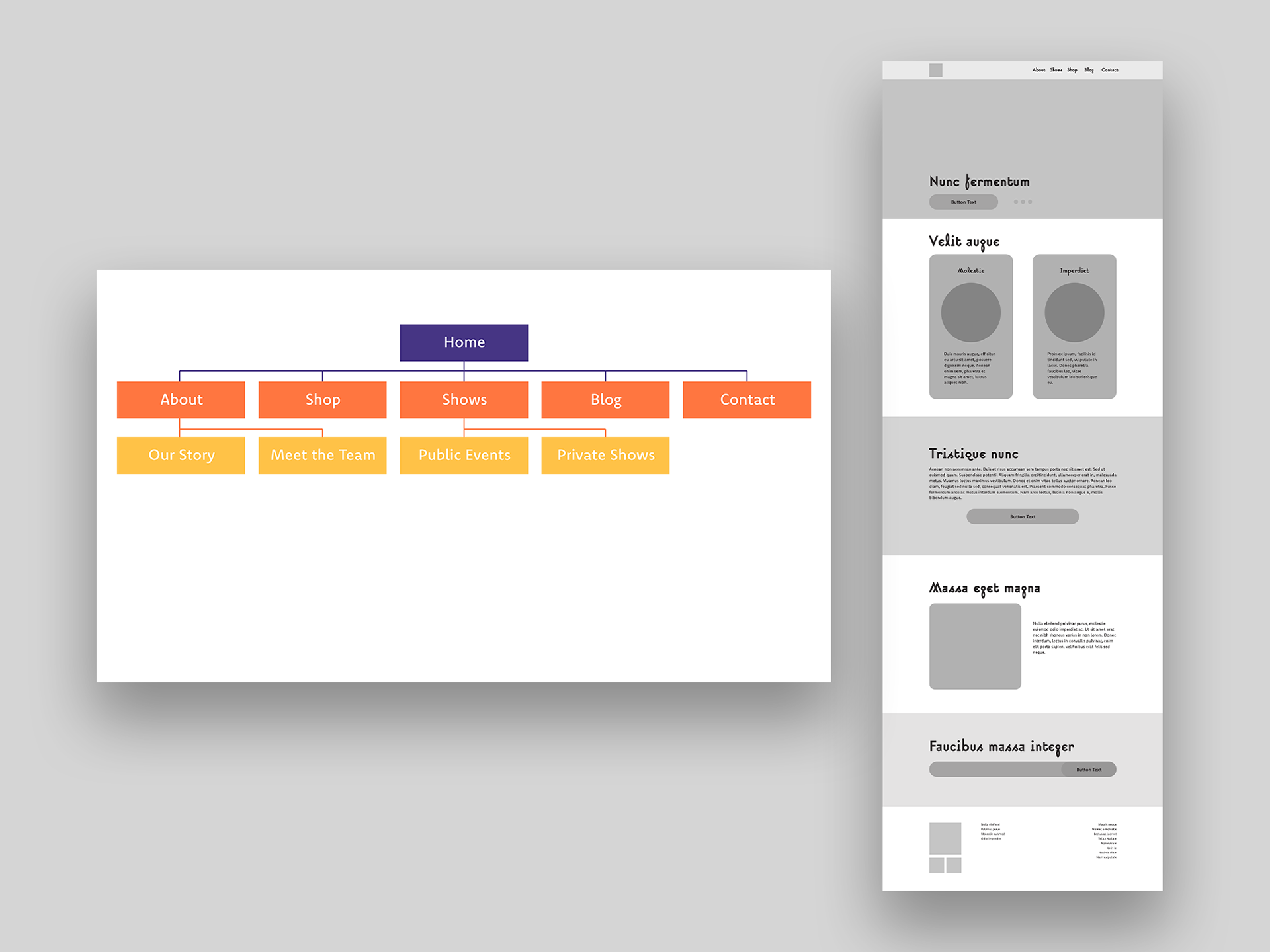
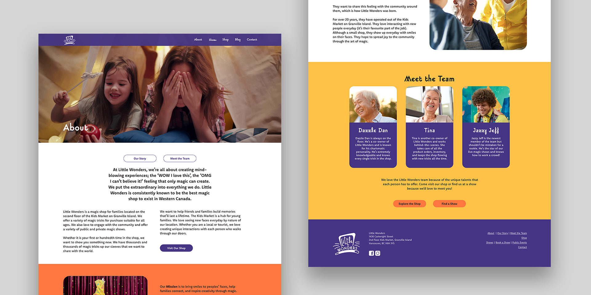
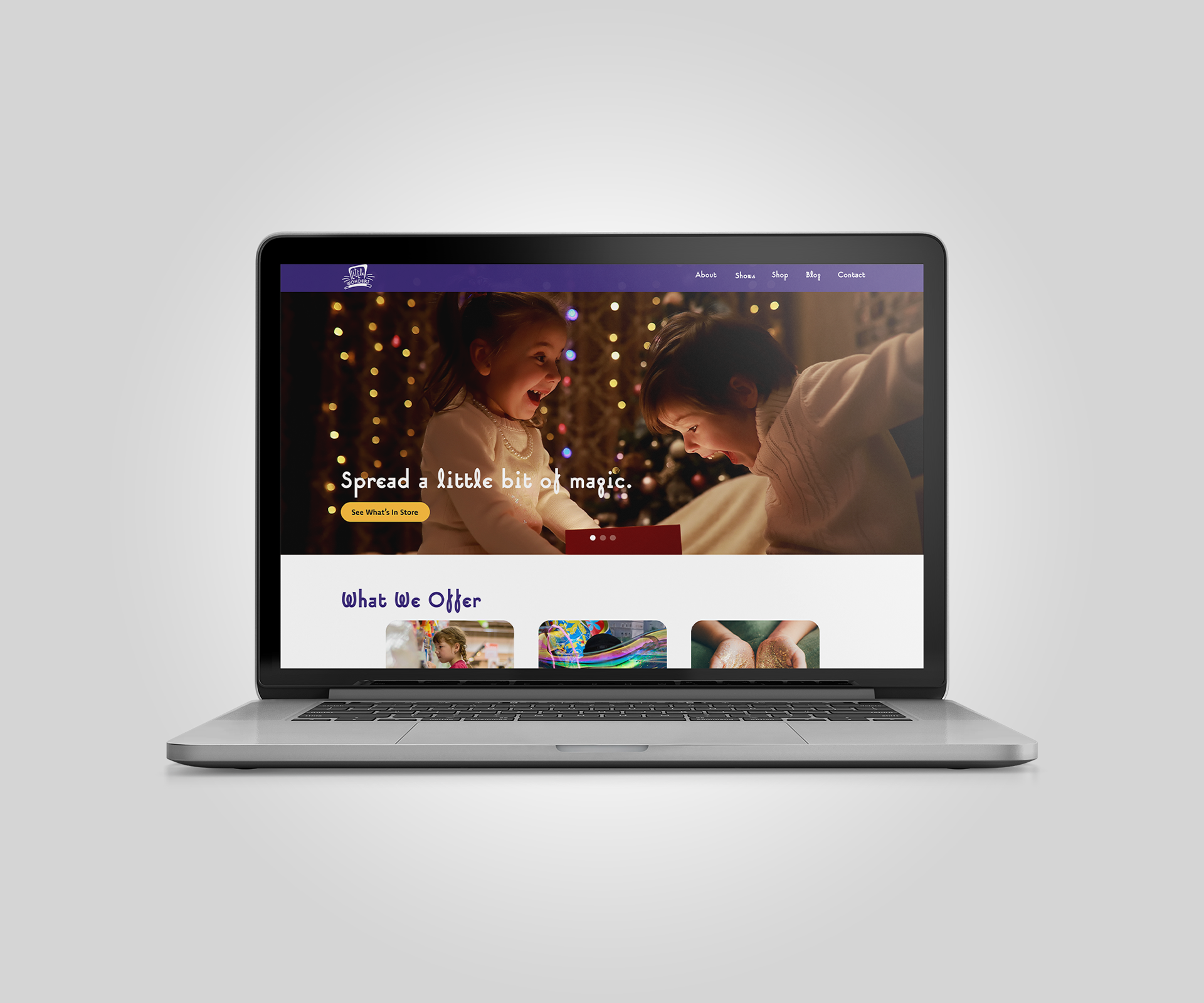
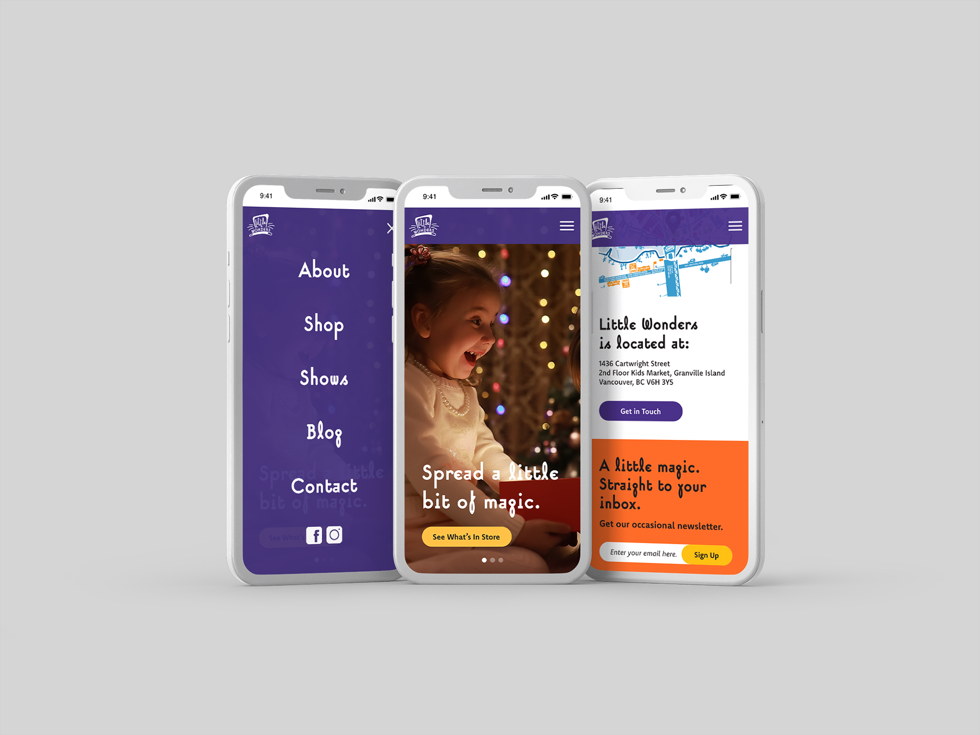
For the website, I started by creating a site map and wireframe of the desktop version in Adobe XD to organize the site pages and content. Both versions of the websites are made using a square grid with a 10% margin on each side, making use of white space to focus the reader's attention on the website content.
Photography for the website has been intentionally selected to spotlight positive relationships,, creativity, and inspiration.
Note: All photographs are from royalty-free sources.
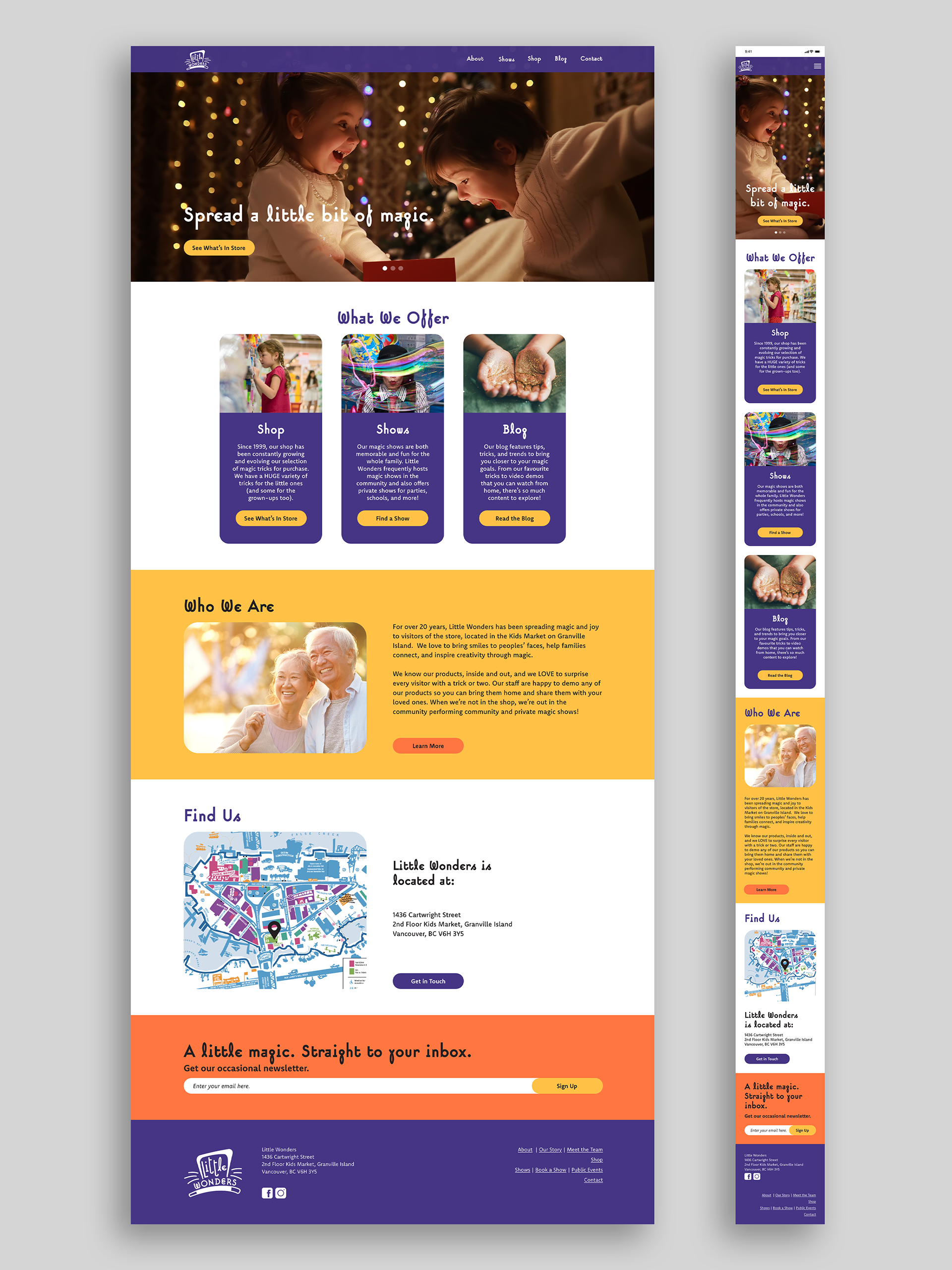
I created the desktop website with a width of 1400px, a common width for personal laptops. This allowed for a responsive design that could adapt easily to larger screens. The mobile version was created with an aspect ratio of 9:19.5 (iPhone X). Each version has been designed to provide a seamless, user-friendly experience.
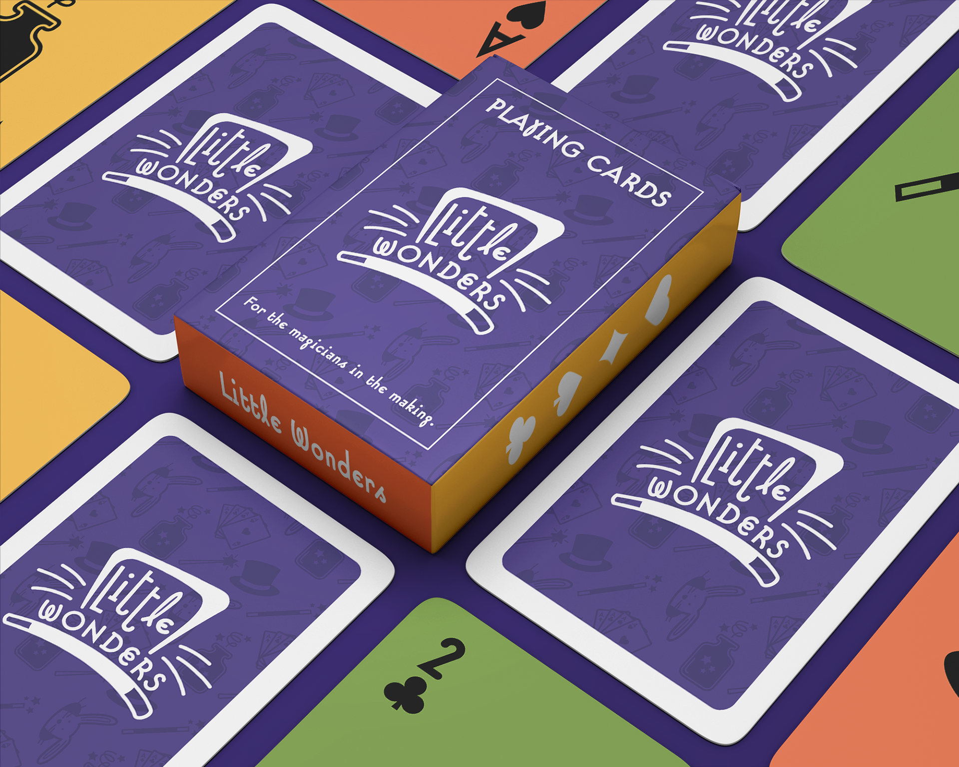
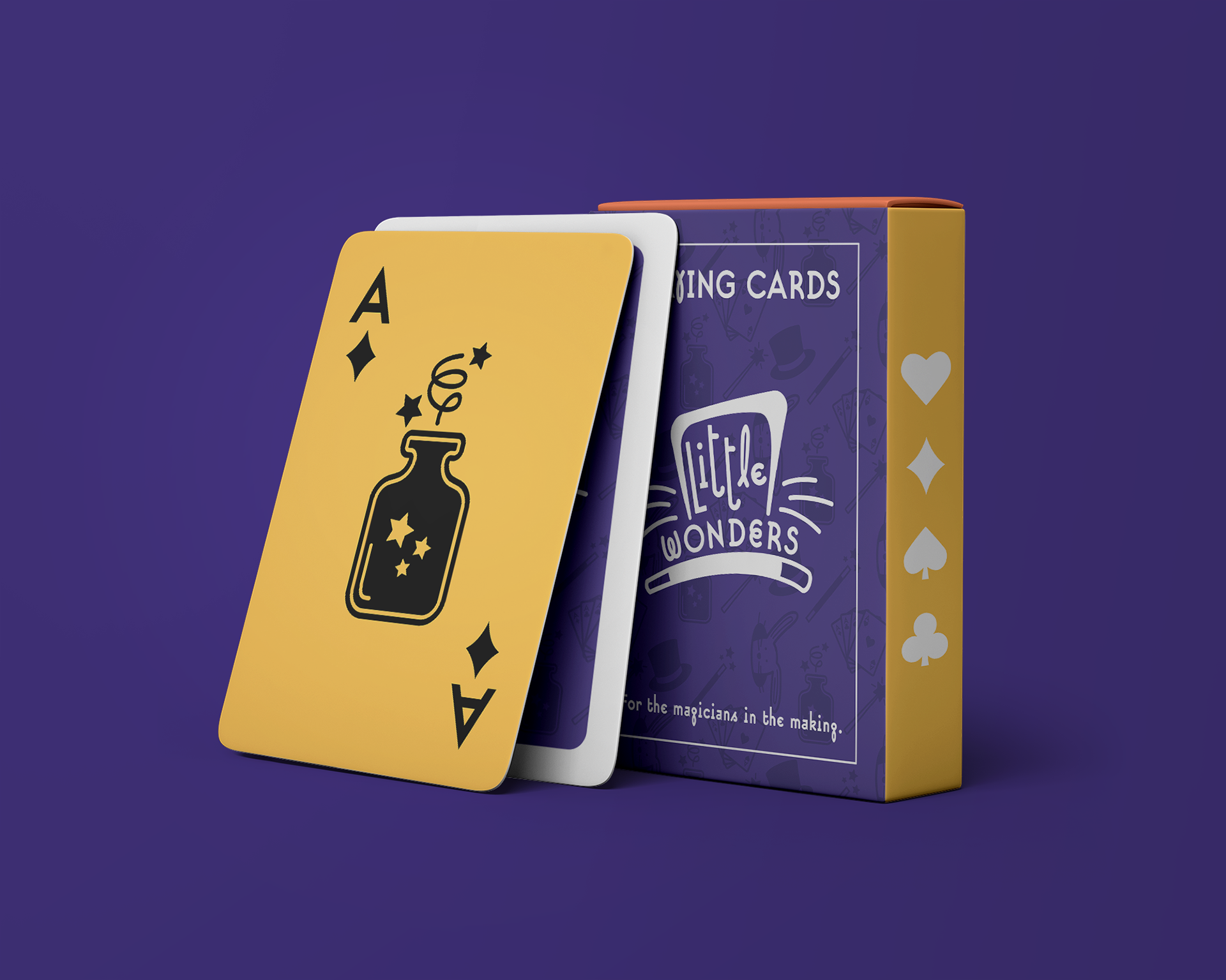
Every little magician needs their own card deck. This deck of playing cards was made to be kid-friendly with large numbers, symbols, and loud colours.
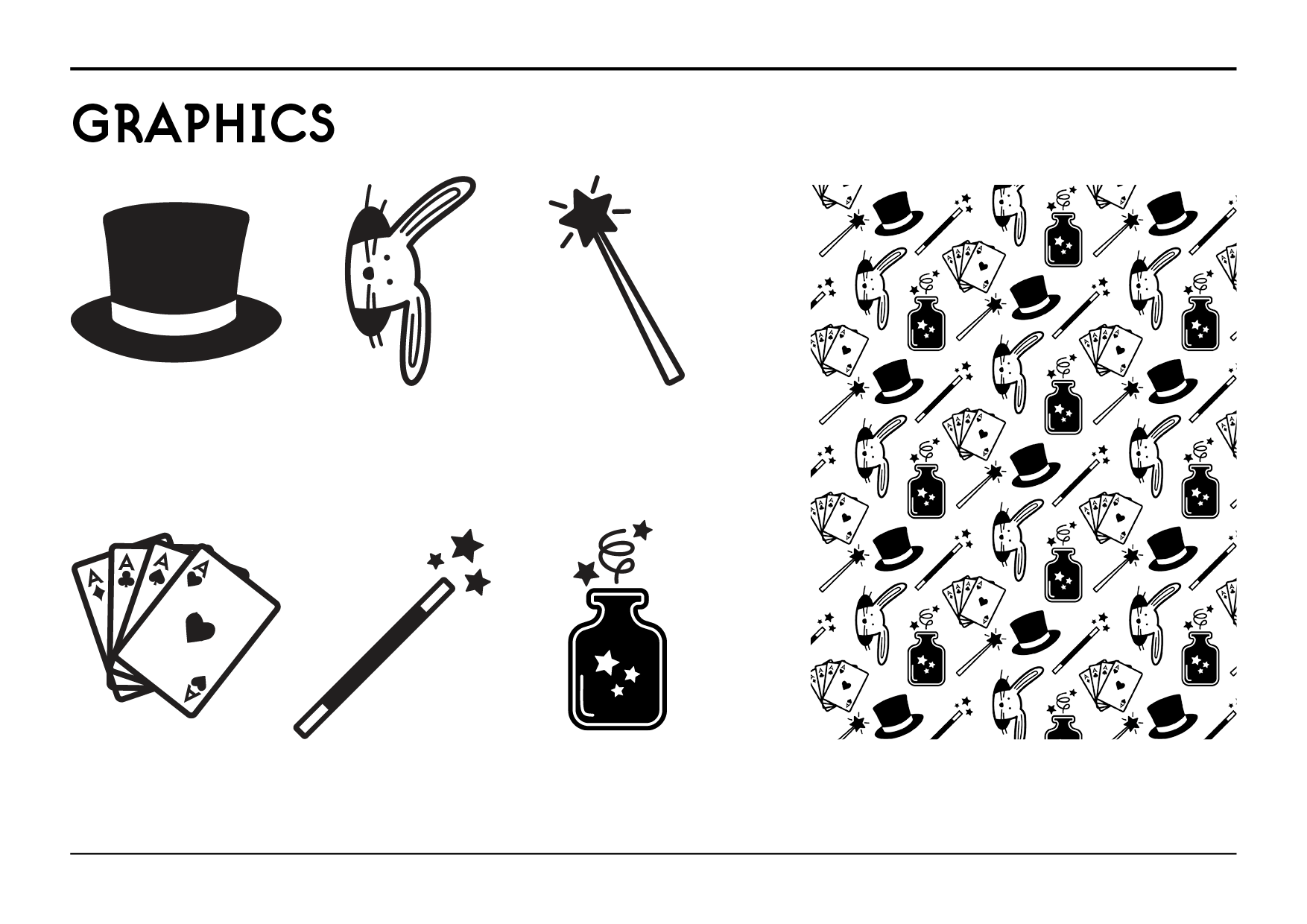
I also made magic-themed graphics in Illustrator that I turned into a pattern. This created unity across all materials, such as the v but professional stationary set.