Camper is a new campervan lifestyle magazine being developed for print and digital mediums. I was responsible for creating the branding, promotional images and editorial design for the magazine.
This magazine is made for those who love the van life—whether they’re currently (or dreaming of) living out of a campervan. Camper is not just a magazine, but a journal for those who love to explore.
It is made in collaboration with photographers, writers, and editors who all share a passion for this lifestyle.
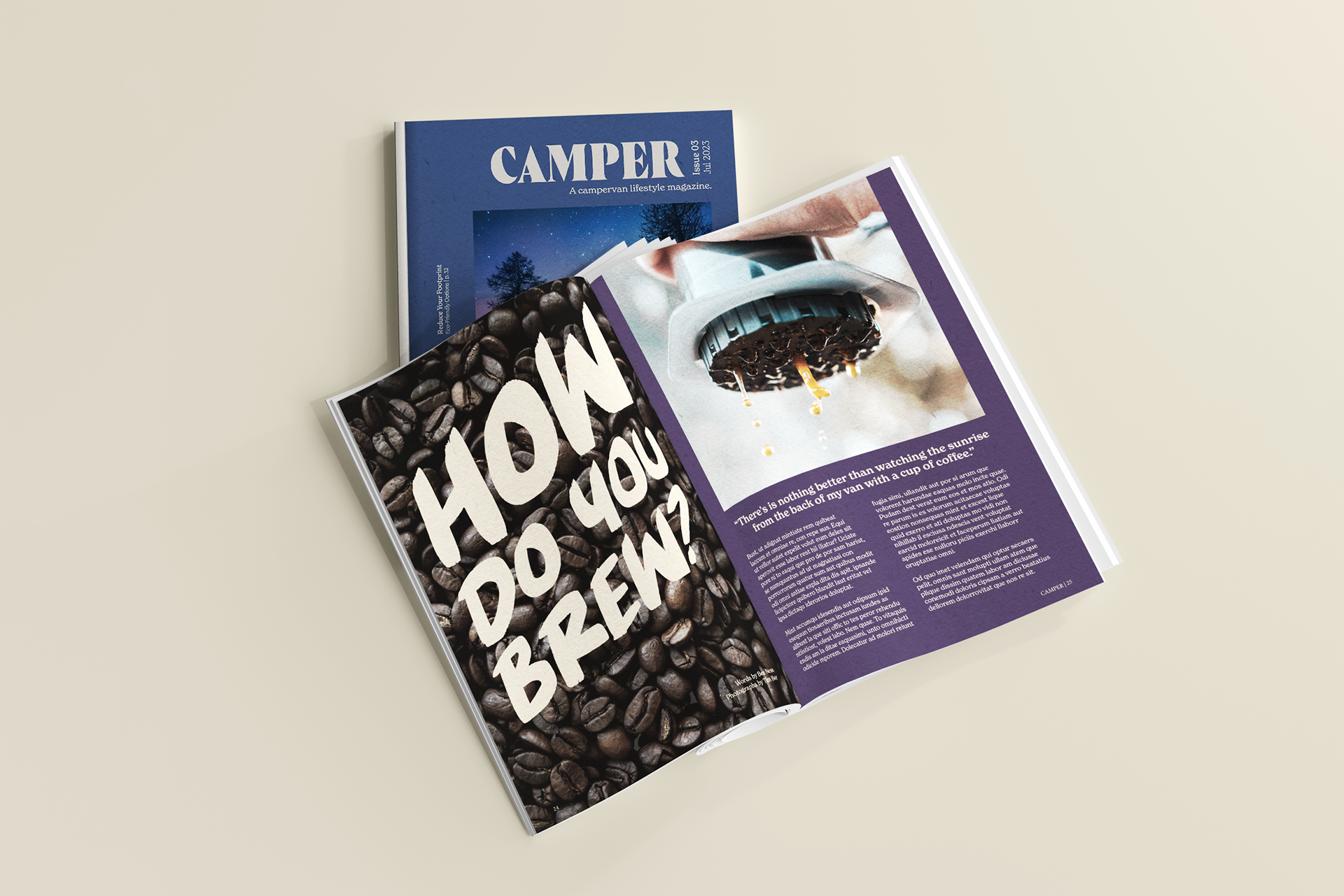
Designing a magazine that had the same look and feel across print and digital mediums was a constraint of the project. I adapted to this by carefully tweaking the layout for each medium with readability in mind.
I started the design of the magazine by conceptualizing the overall feel through sketches.
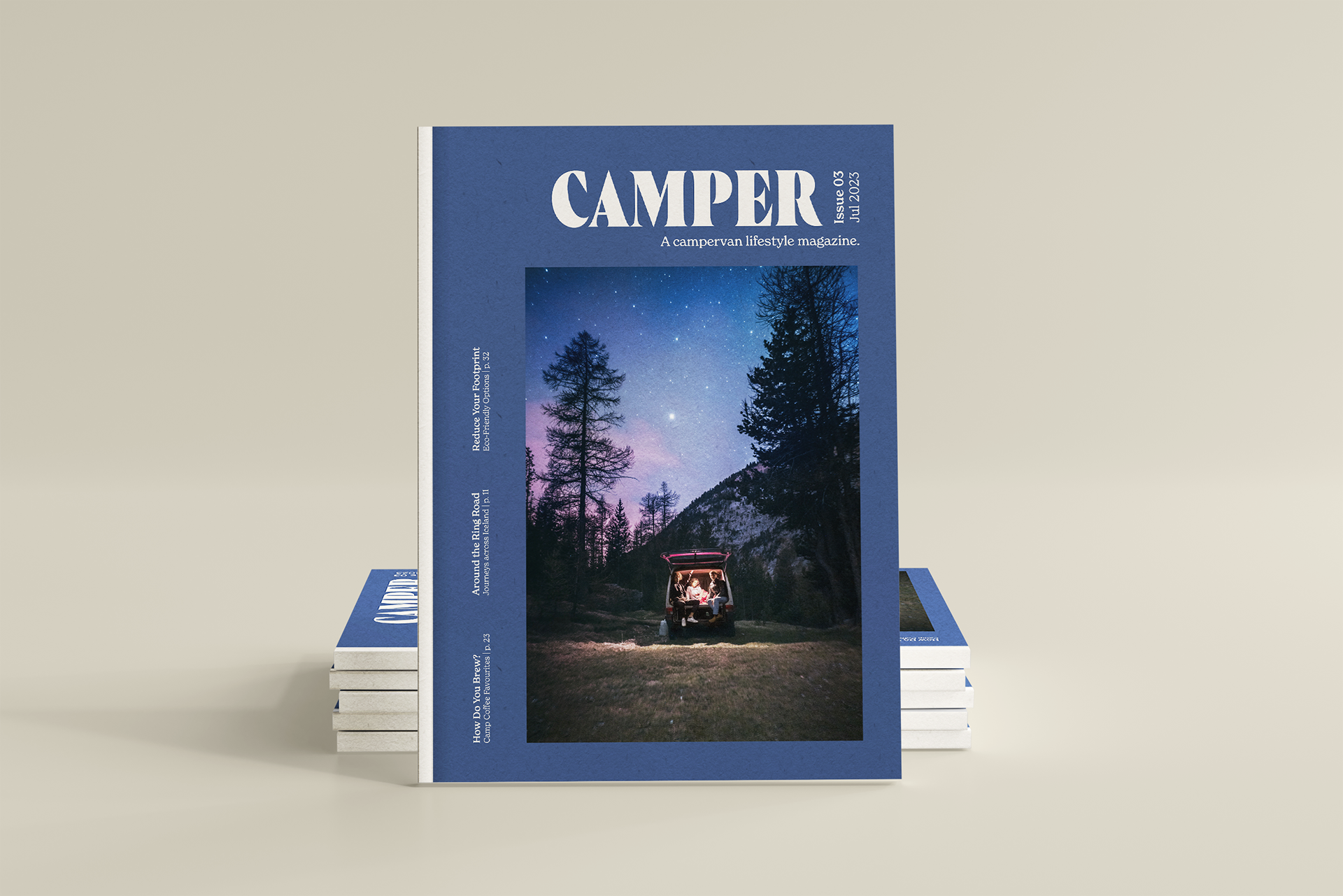
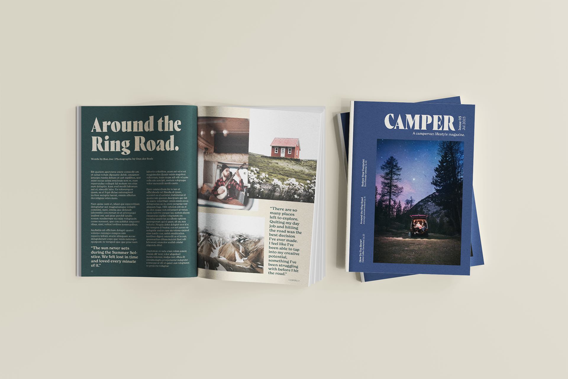
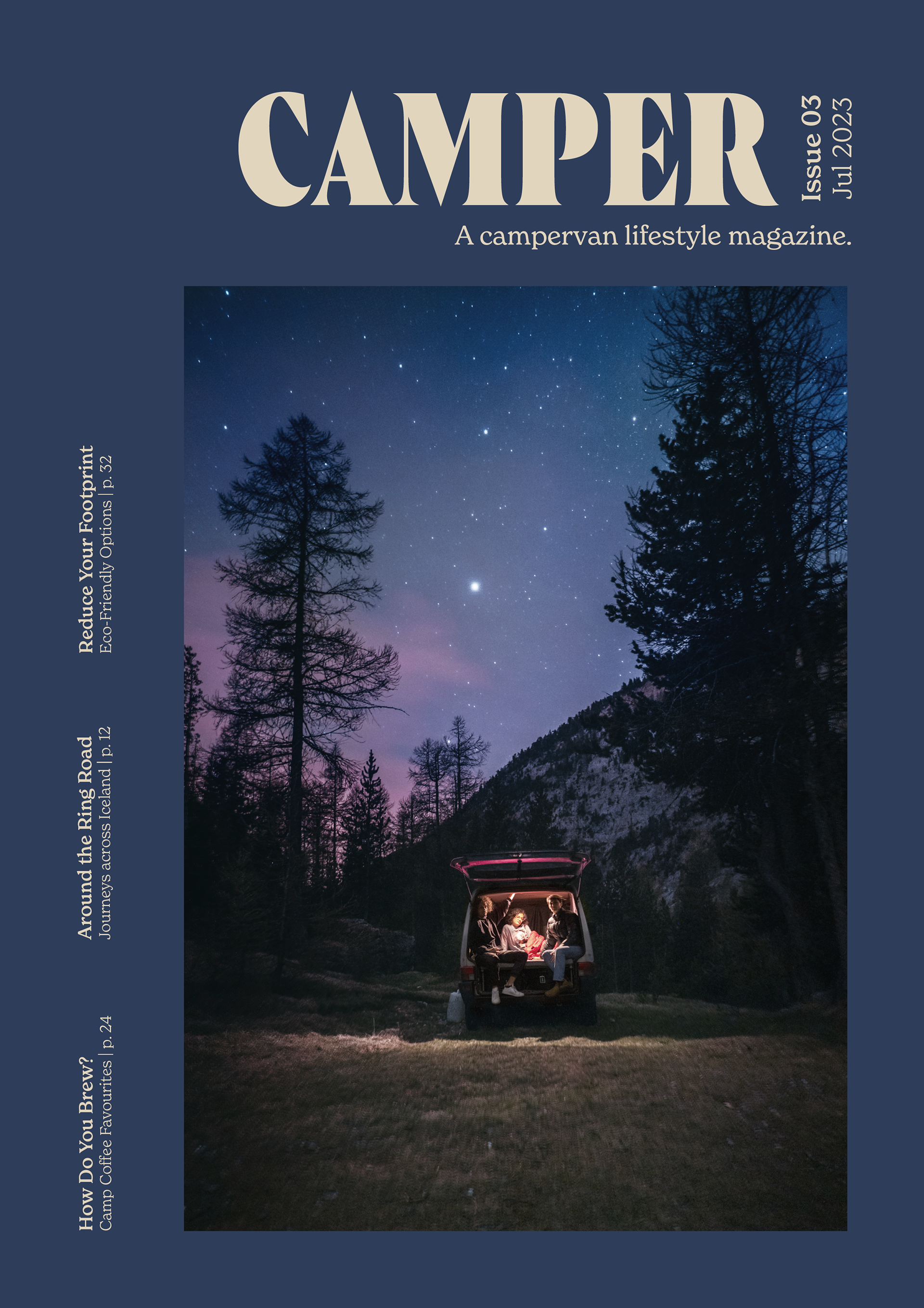
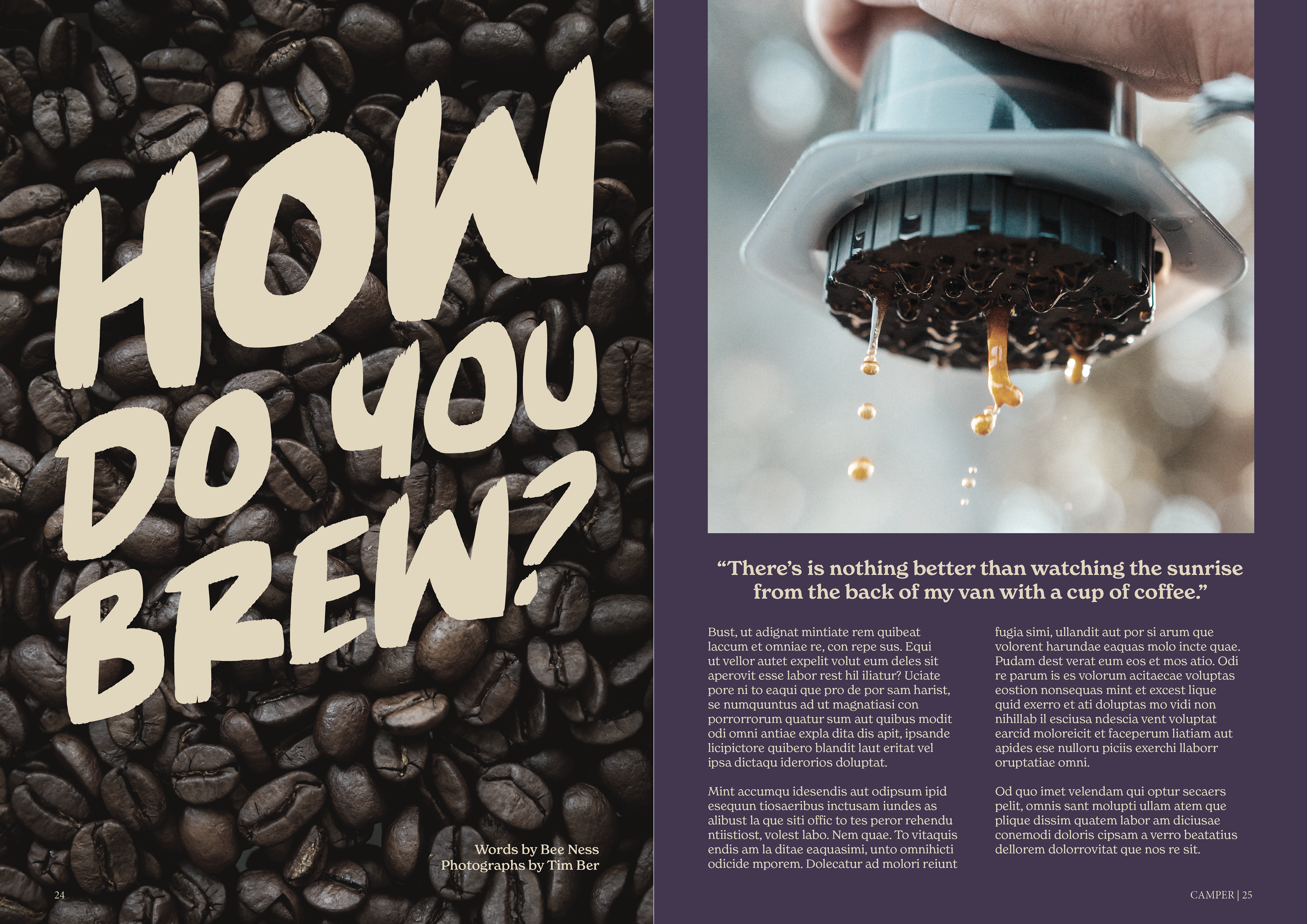
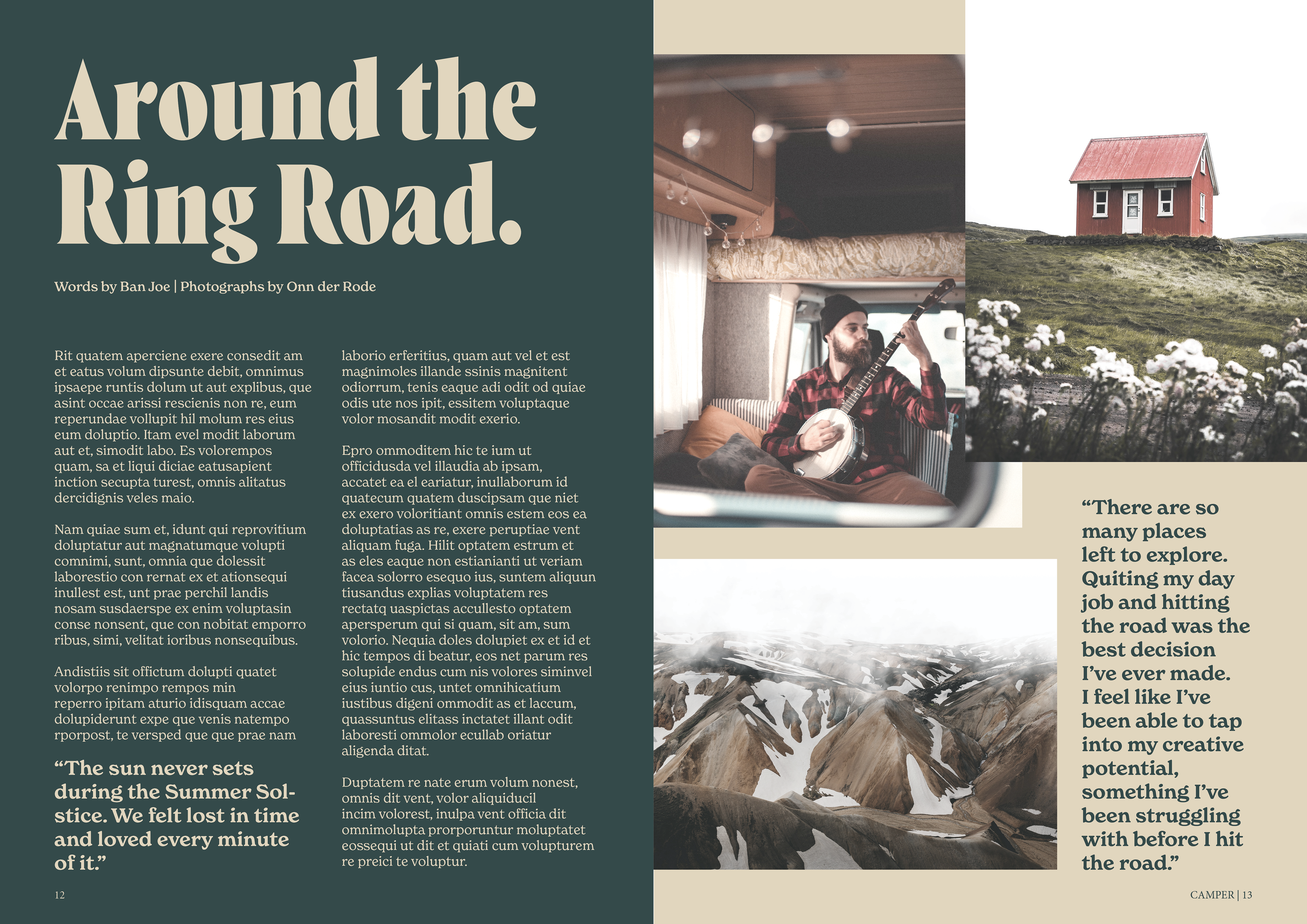
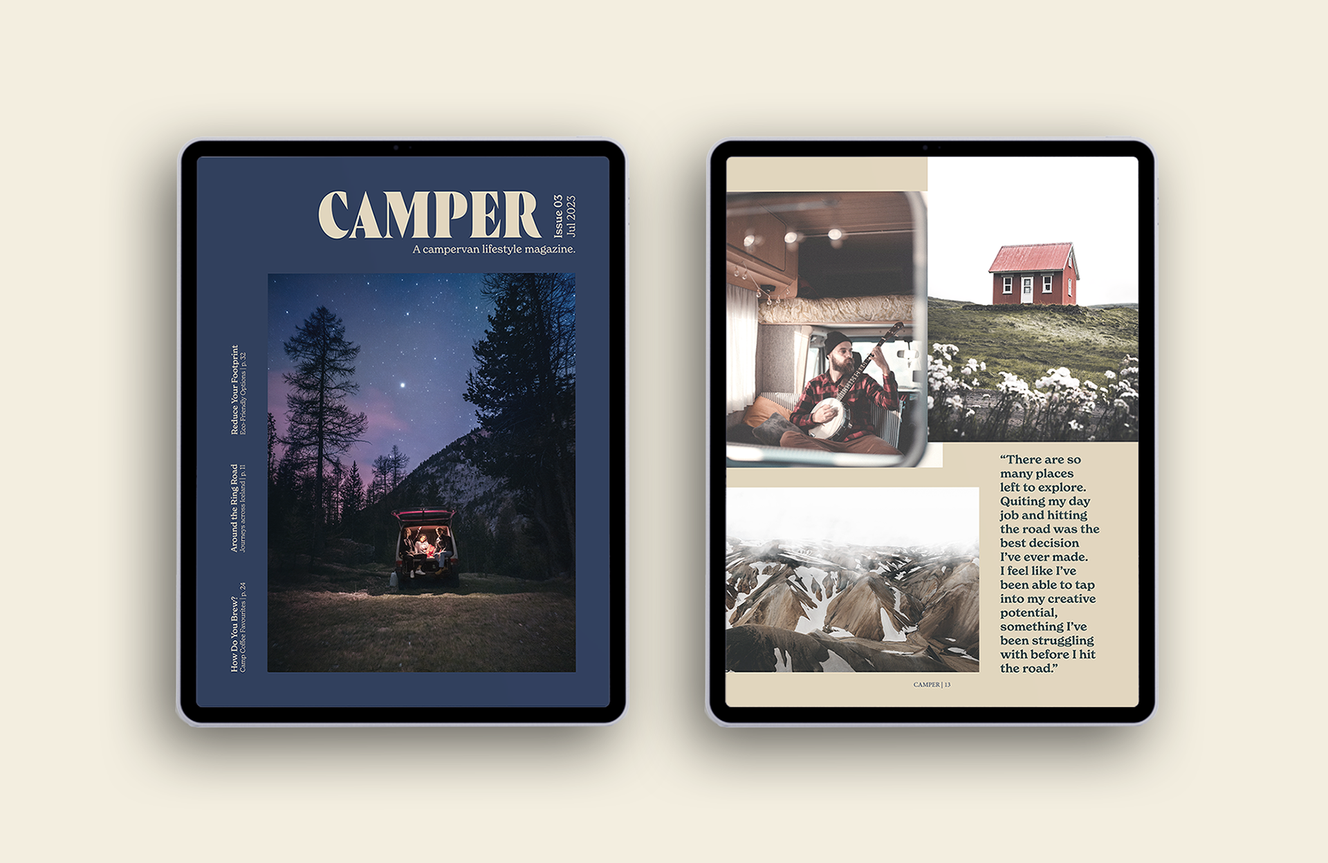
My next step was to choose powerful typography to match the brand, create a cohesive colour palette, and select photographs. I wanted the magazine to have a calming, modern, earthy feel. All photographs were edited in Photoshop to establish a consistent, slightly washed-out look.
I created the print version in InDesign first, using rulers and grids to ensure consistency across all pages. The print magazine is A4 size, measuring 8.27" x 11.69".
The iPad Retina version was created next in InDesign using a similar grid system, with an aspect ratio of 4:3.
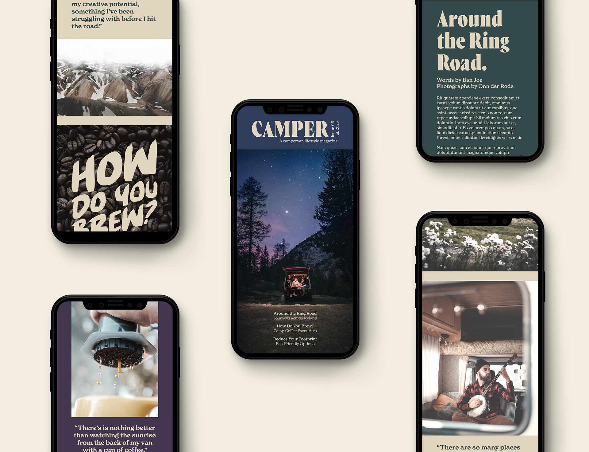
The mobile version (aspect ratio of 9:19.5) was created in Illustrator as a continuous scrolling magazine. Guidelines were used on the left and right sides to allow space for a user's hands while holding their phone to read the magazine.
The main typeface used for the body copy is New Spirit. I selected this typeface as it has various weights that could be used to emphasize different parts of the magazine. It is also very readable across all platforms, from larger print magazines to small phone screens.