The Banff Farmers Market is a weekly market held in Banff, AB. This design study looks at refreshing the brand identity to better reflect the one-of-a-kind market that attracts thousands of locals and tourists each week.
The market is unique in that it's a one-stop-shop for fresh produce and food, artisan crafts, and live music, right in the heart of the rocky mountains. These elements together create a sense of collectivity and community for its attendees.
Deliverables for this project included a brand style guide, truck wrap, print and digital advertisements, merchandise, and miscellaneous communications materials.
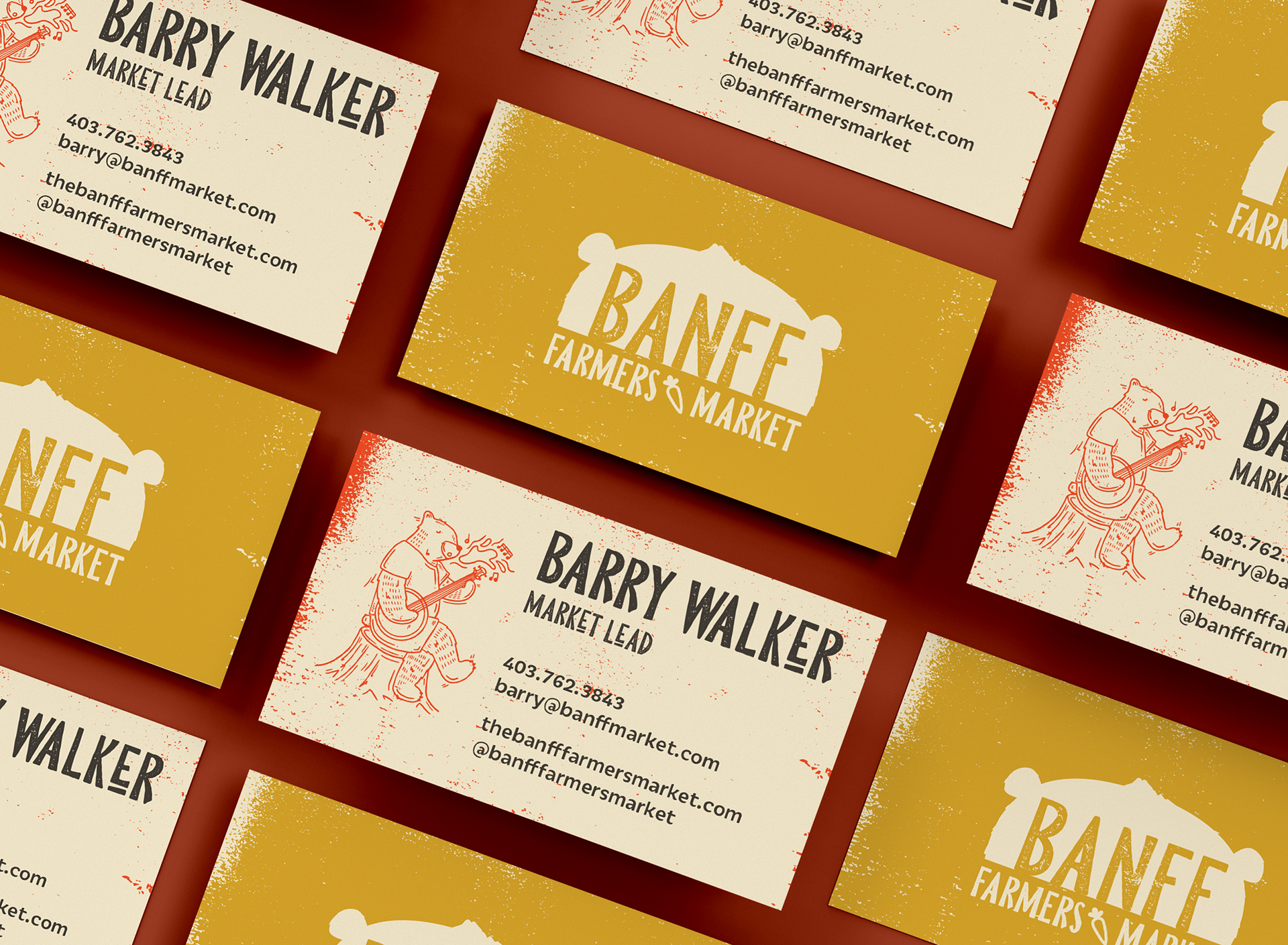
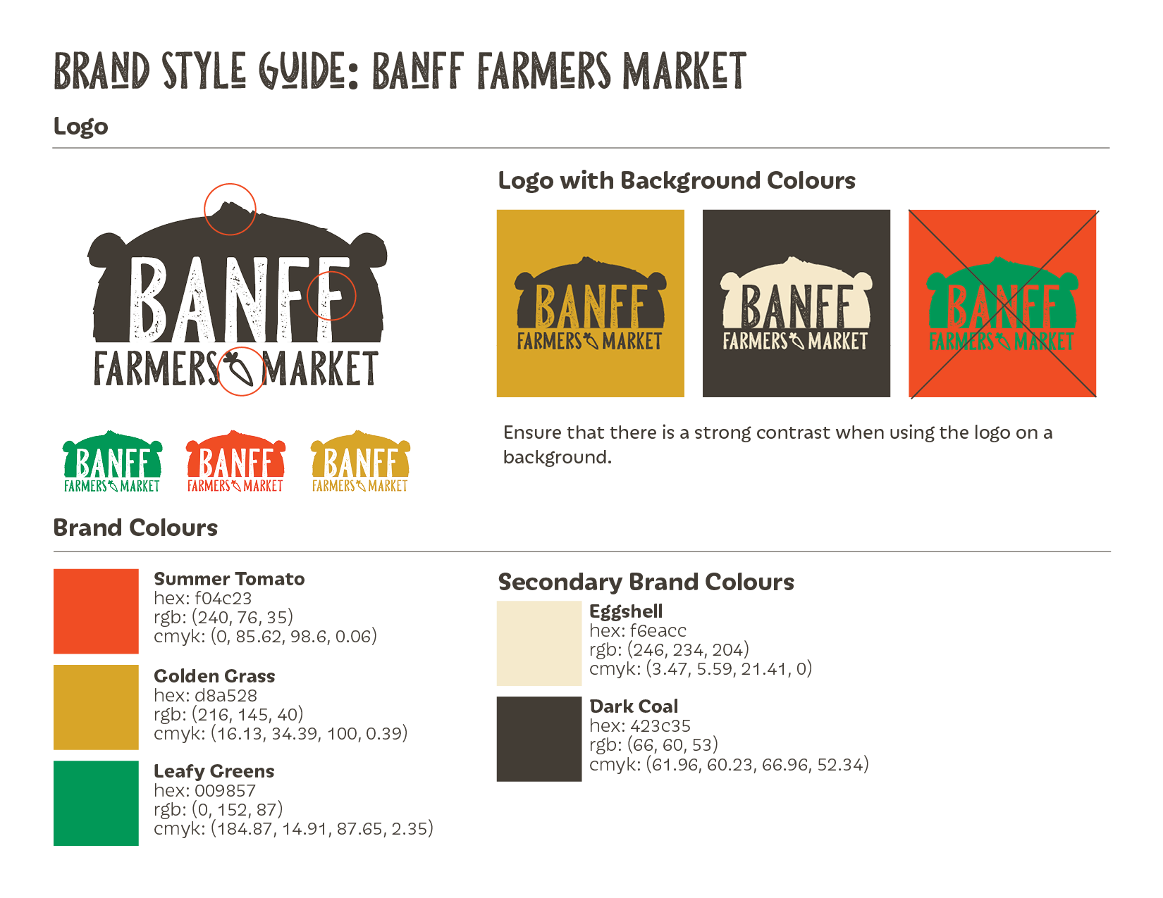
In the logo, the hair tuft represents Waskahigan Watchi (colonially known as Rundle Mountain), one of the most well-known mountains in Banff. Other elements that tie the logo together include the bear silhouette, carrot, and rustic texture of the text.
Each of the brand colours also carry their own meanings:
Summer Tomato: freshness, creativity, affordability
Golden Grass: warmth, optimism, diversity
Leafy Greens: growth, nature, community
Golden Grass: warmth, optimism, diversity
Leafy Greens: growth, nature, community
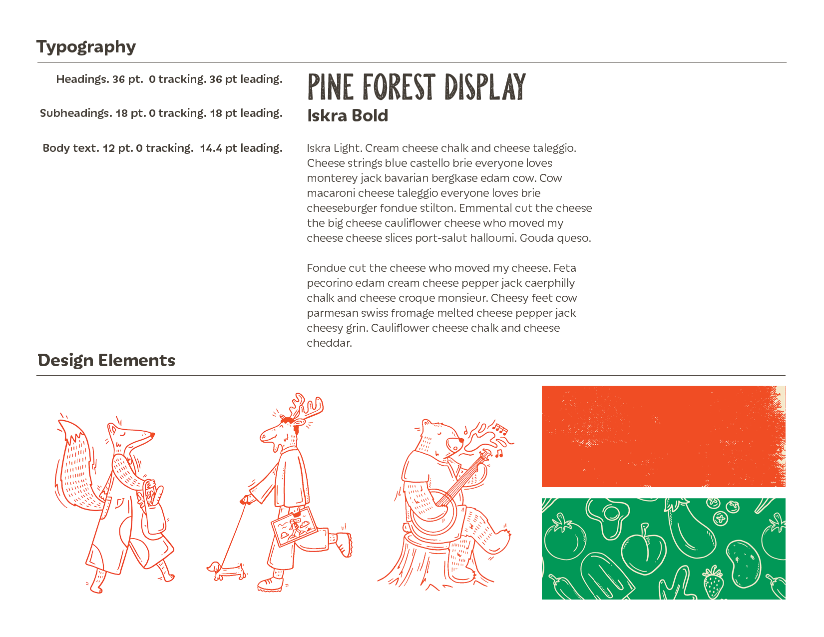
For typography, Pine Forest Display was selected for its earthy feel and subtle grainy texture. Iskra was selected for it's large variety of weights, cheerful elements, and readability,
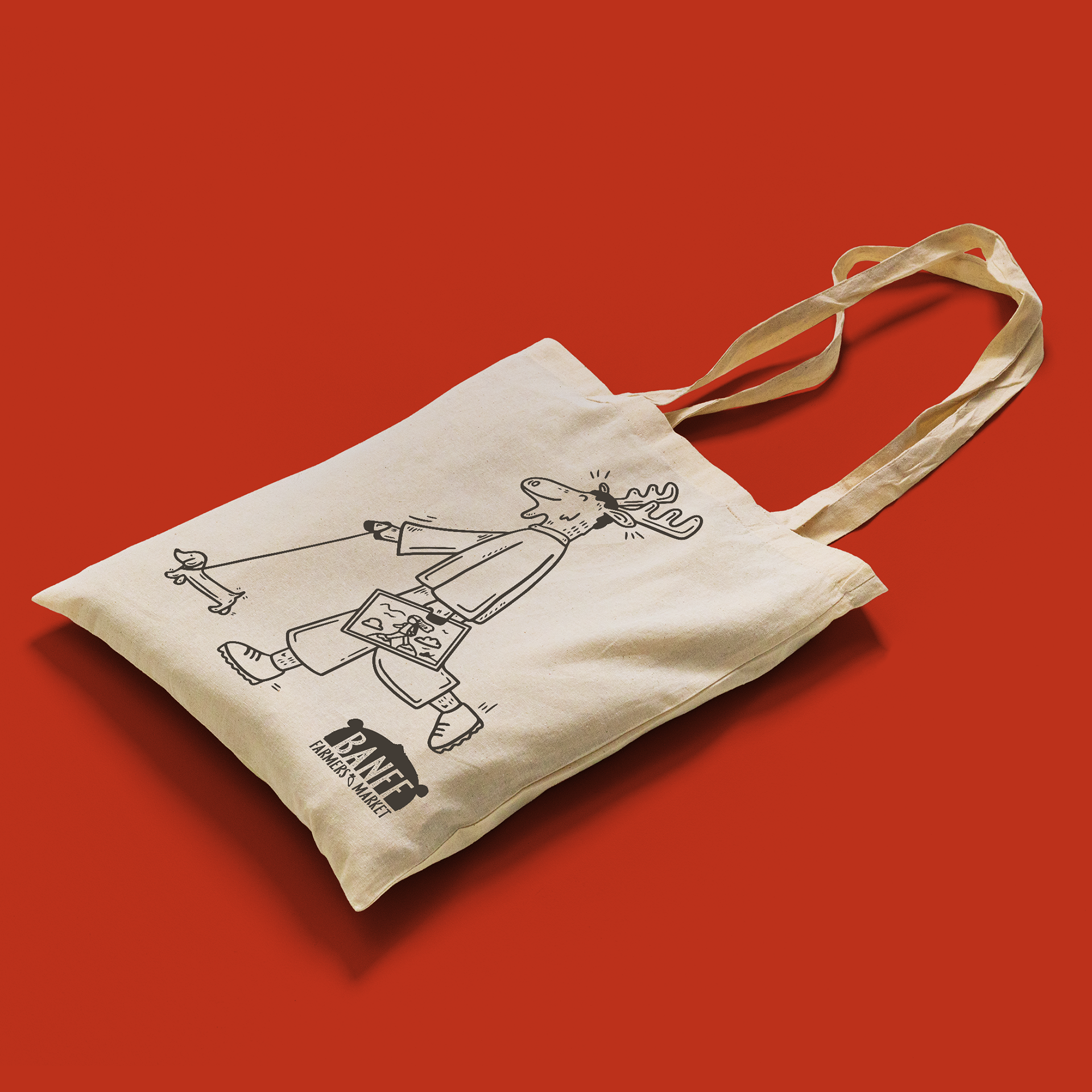
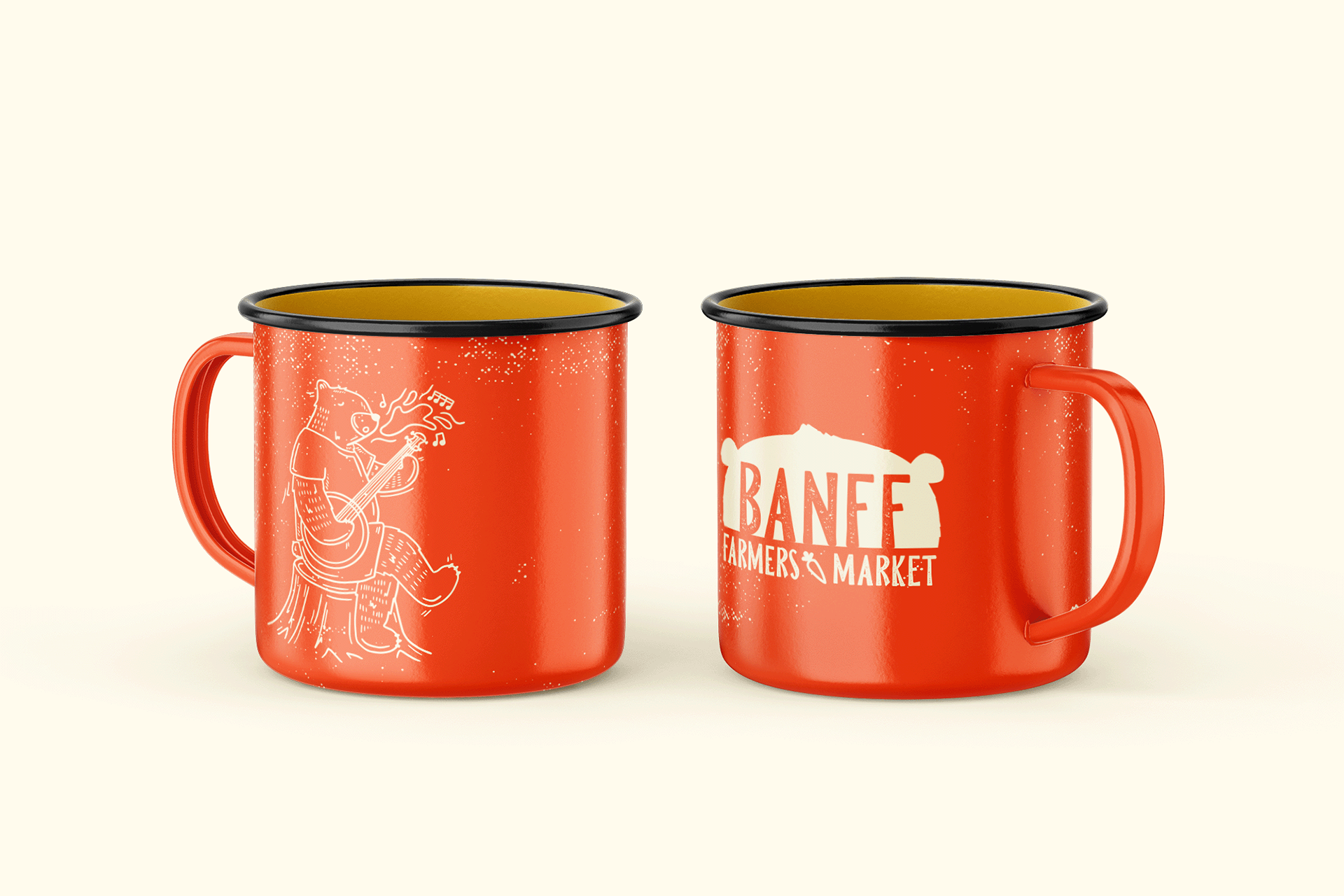
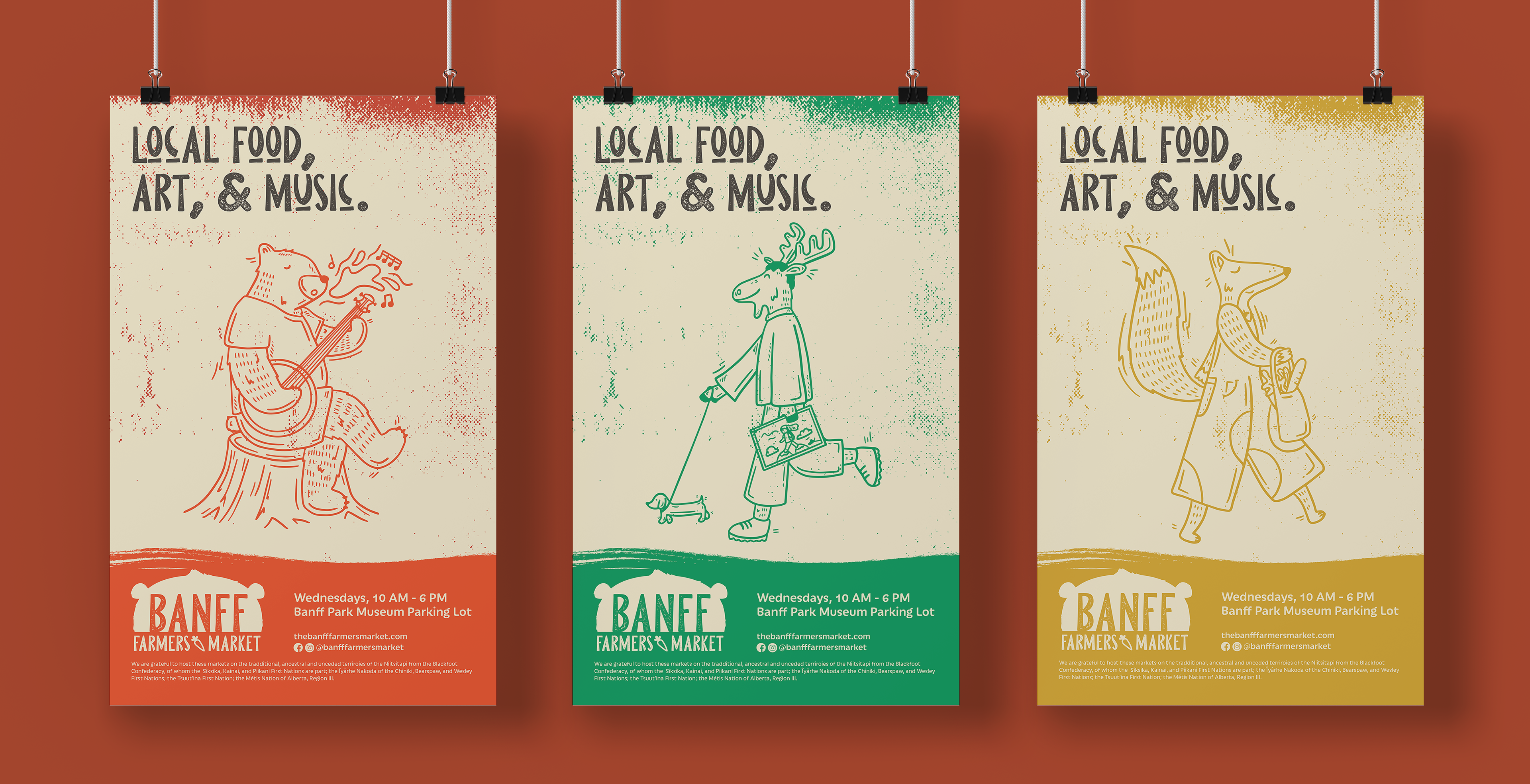
I created illustrations in Procreate and vectorized them in Illustrator to maintain the hand-drawn, artisan look. The fox represents local food, the moose represents art, and the bear represents live music. Together, they go along with the tagline: Local Food, Art, and Music.
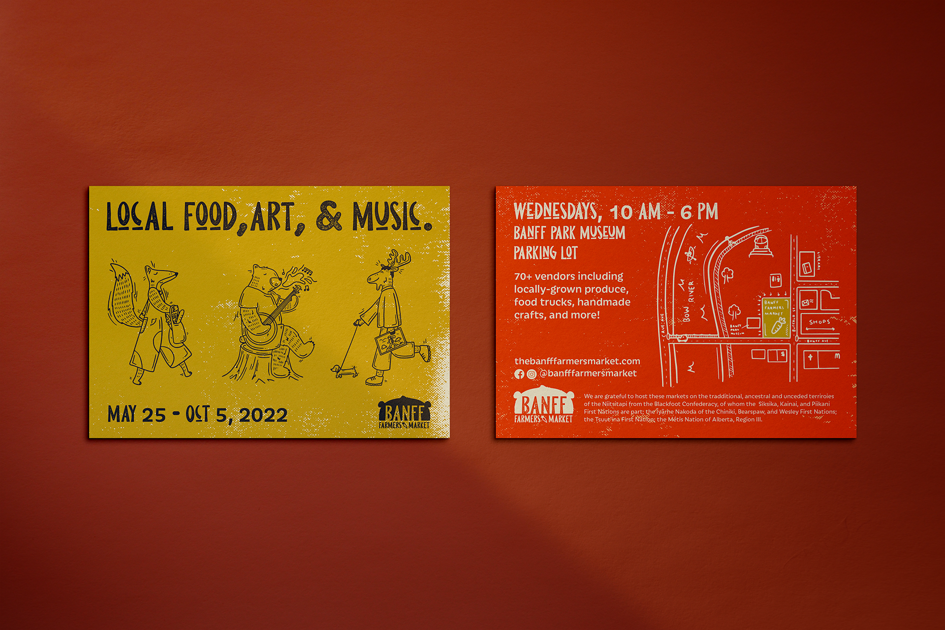
I added a simple illustrated map to the 4" x 6" double-sided postcard to help customers locate the market, and placed the logo on both sides for easy brand recognition.
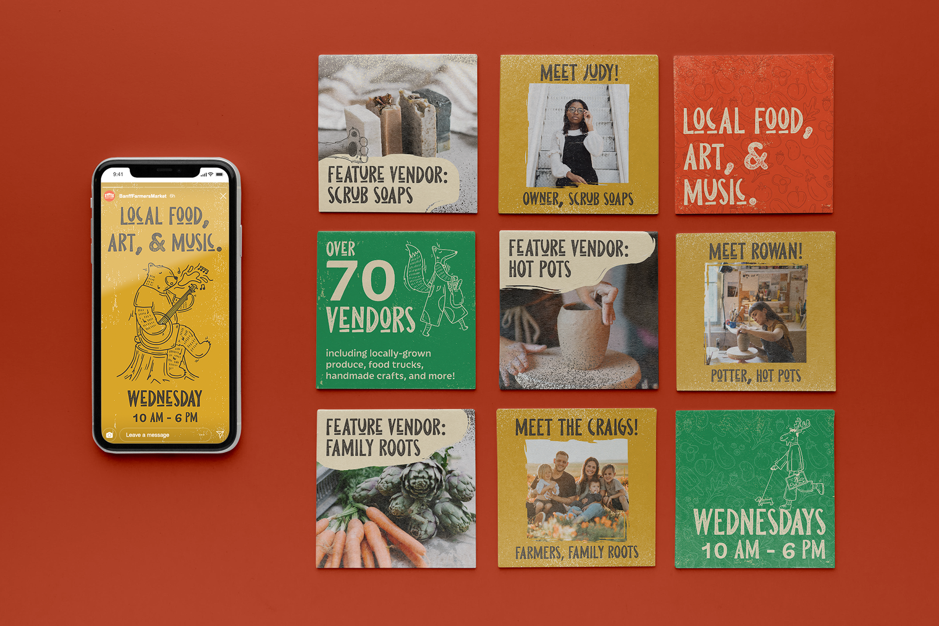
I used an Instagram grid as an opportunity to highlight key parts of the market and its vendors. This creates a culture of community and familiarity between the vendors and customers.
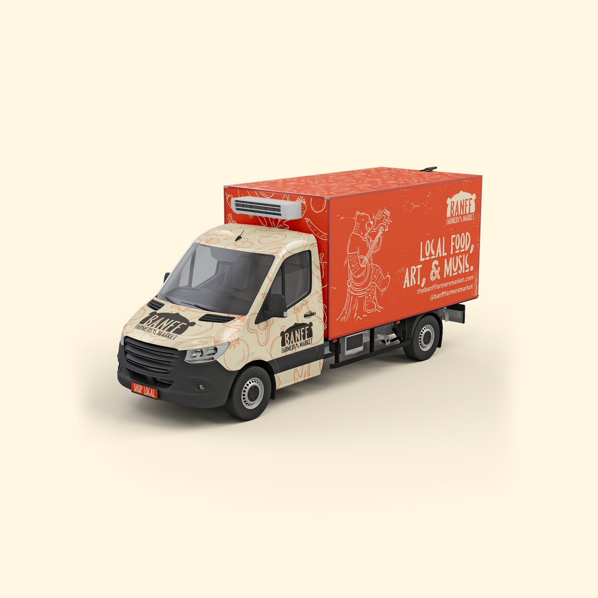
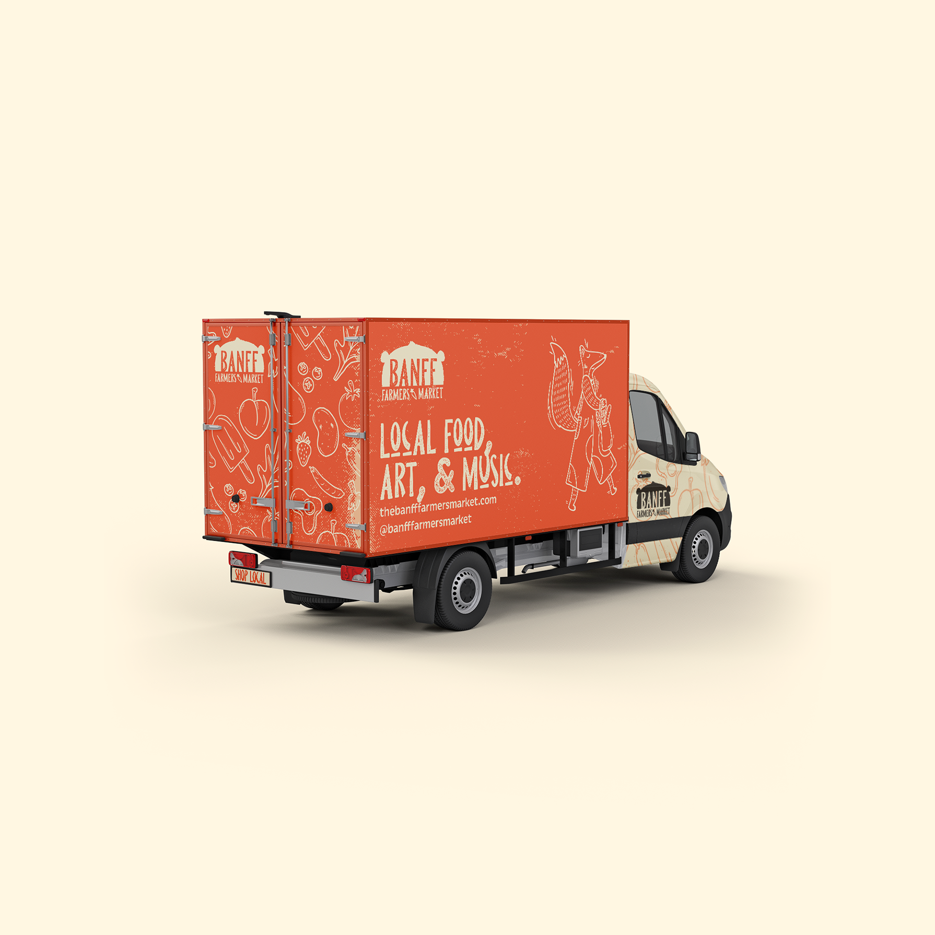
For the box truck, the logo, text, and illustrations are made large to be easily seen from a distance while transporting equipment to and from the market.
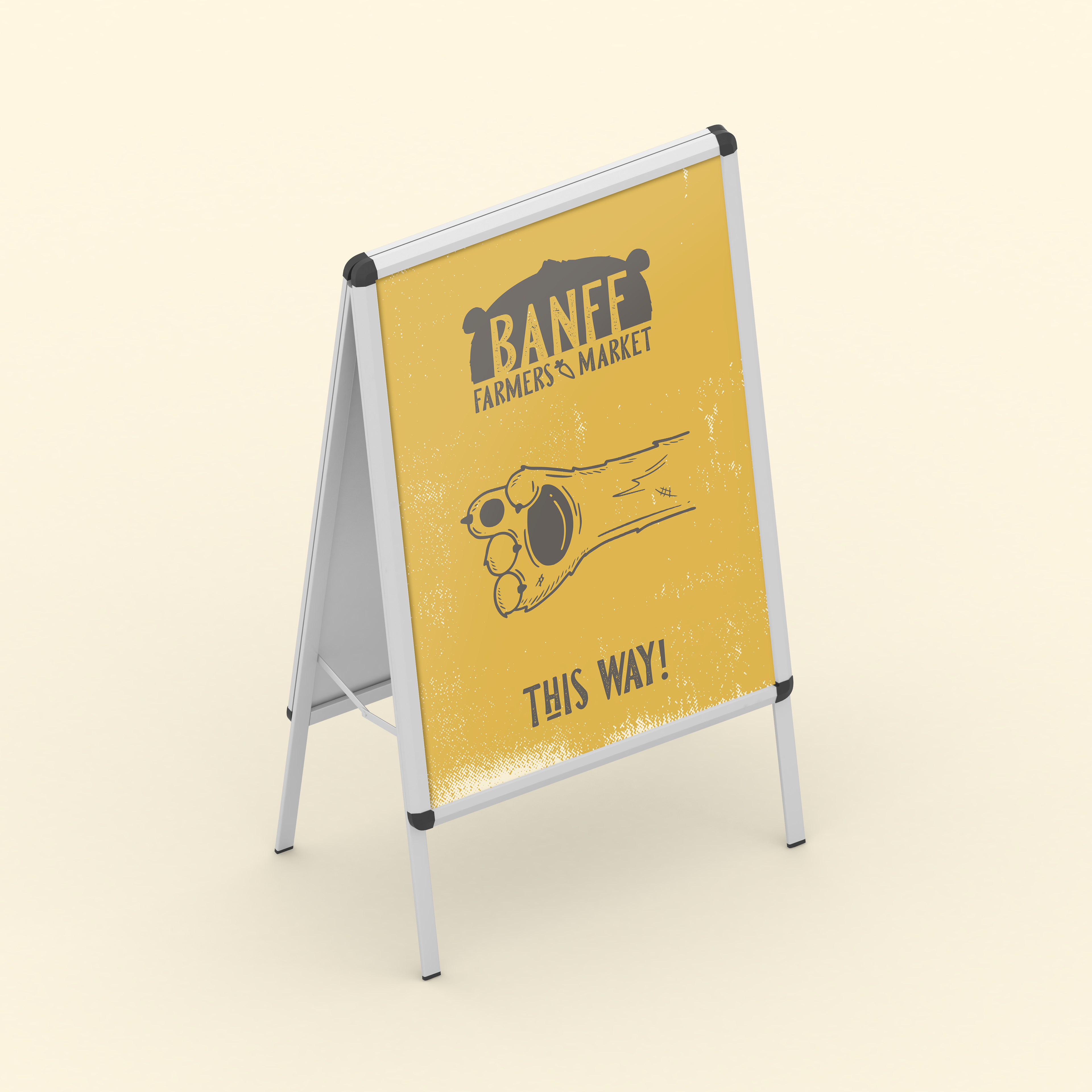
The wayfinding sign features an illustrated bear paw directing the public to the market. I made the market tent and staff shirts the same colour so that customers can easily recognize staff if they need assistance.
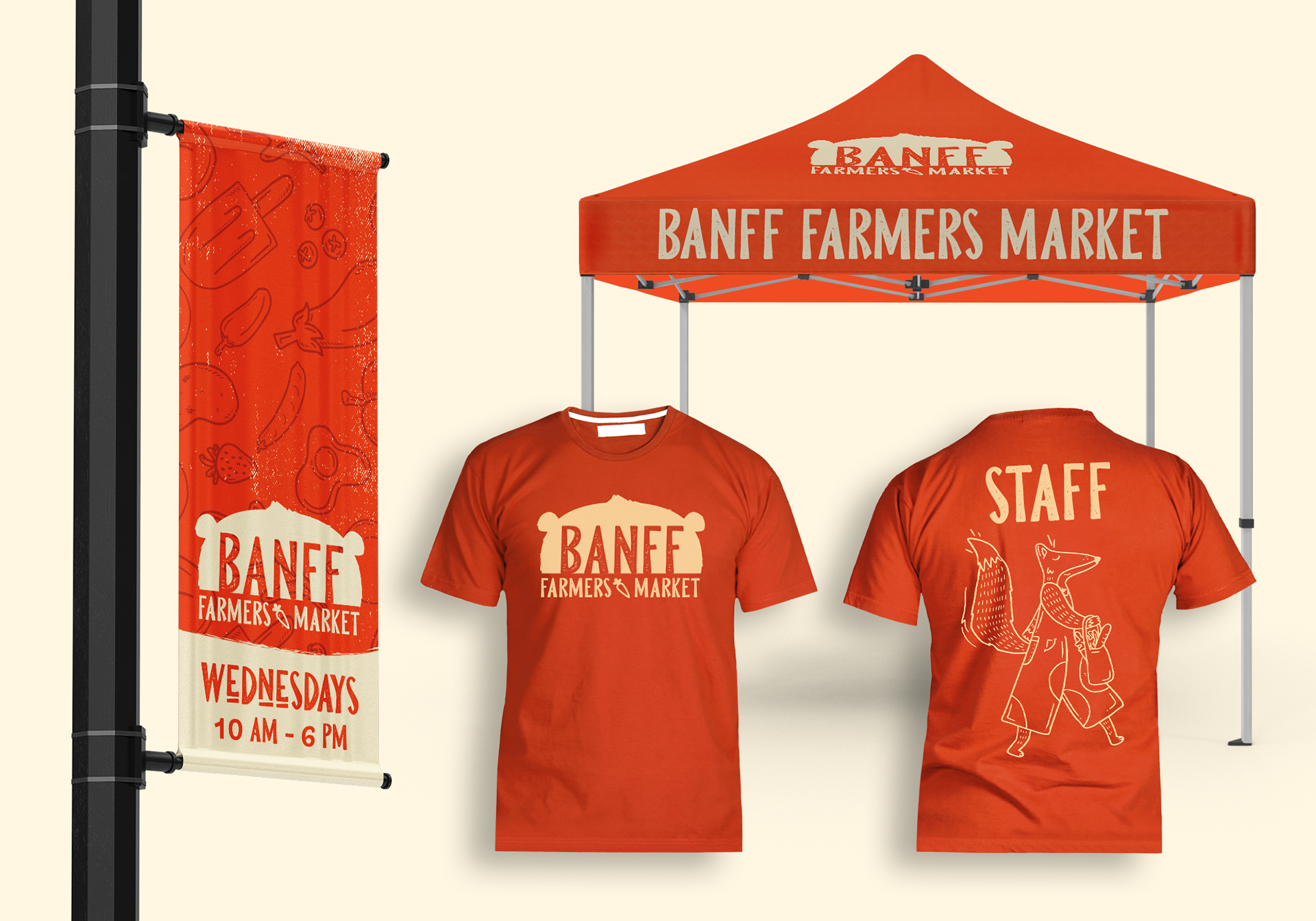
Merchandise features the illustrated characters as memorable keepsake items for purchase. They also continue to build a sense of community when friends and families see these items being used around town.